
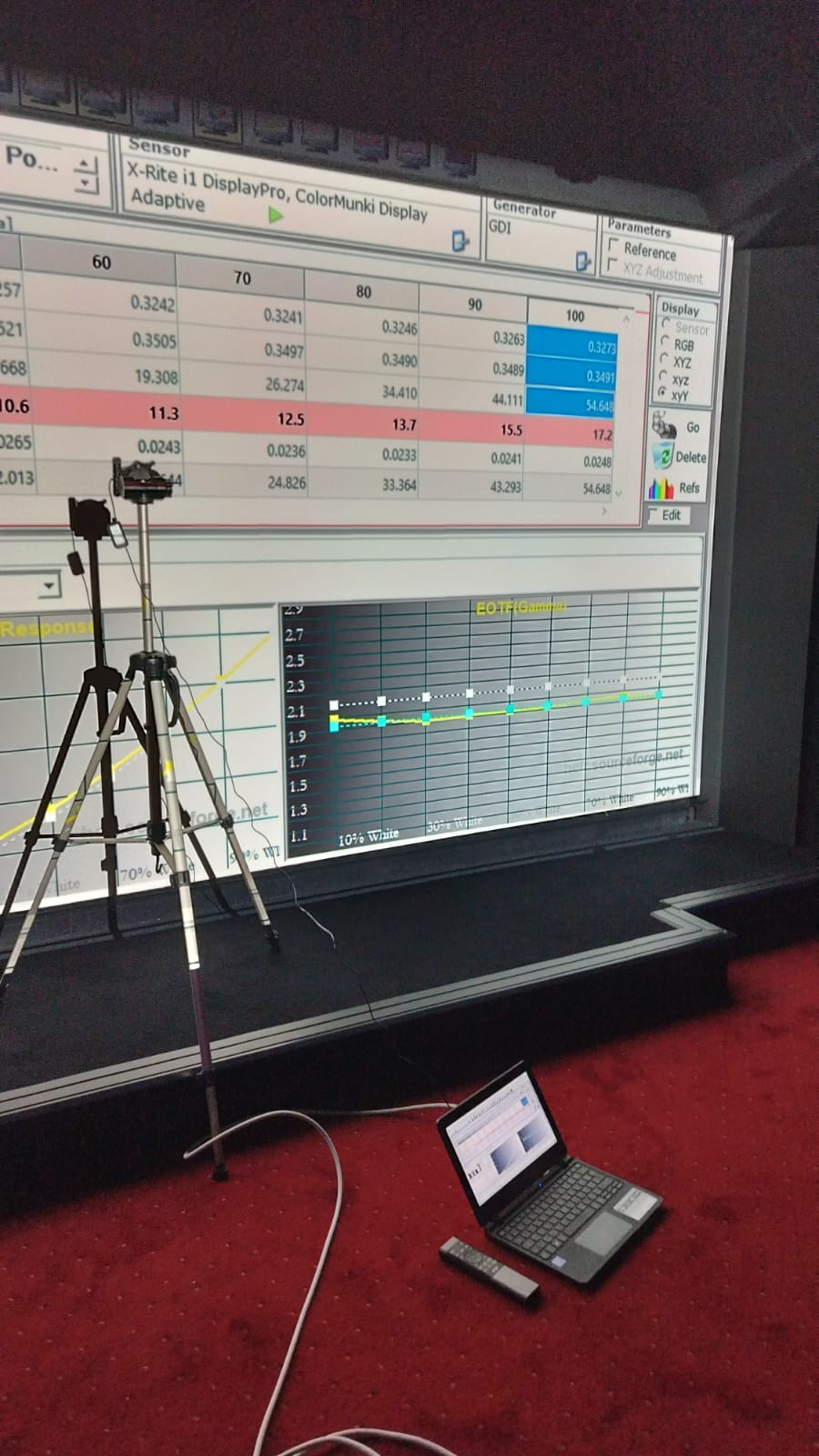
This tutorial describes one calibration method among others, tried on several displays. The brands and models named are there to illustrate the menus you will meet, never as a buying recommendation.
For a six-step overview rather than the full walkthrough, see the ColorHCFR guide. Once your measurements are done, the .chc file imports into HTM.
The purpose of this tutorial is to illustrate the basic principles of video calibration through the use of the ColorHCFR software.
It is aimed above all at people who already own a colorimeter and want to put it to work calibrating their display. The tutorial leans towards projector calibration, but the methodology is much the same for a television, provided it offers the necessary settings.
What follows details the main parameters to act on in order to get the picture right. The tutorial is made of several chapters, organised along 2 axes that follow one another:
- First axis, devoted to calibration to the REC709 standard for HD SDR sources
- Second axis, devoted to calibration to the REC2020 standard for UHD HDR sources
A good grasp of the first axis is needed before tackling the second.
The methodology given throughout this tutorial is of course not meant to be the only one. You will find other methods, using other software as well.
ColorHCFR, however, initially developed by members of the association in the 2000s, remains free and open source. It is fairly complete in terms of settings, as you will see over the following chapters.
Since 2012 the software has been taken over by a team of English-speaking developers who have enriched it, in particular making it compatible with new probes and, above all, ready for HDR calibration.
Preparation
Equipment needed
Here is the equipment needed to calibrate your display:
- A computer with an HDMI output. Prefer a laptop, so it can sit as close as possible to the colorimeter, since USB cable lengths are usually limited. USB extension cables sometimes lack the throughput to power the colorimeter. A simple HD 1080p chipset is enough for REC709 calibration. A recent HDR-capable graphics card can be a plus for HDR calibration, though not strictly indispensable, as we shall see at the end of the tutorial.
- The ColorHCFR v3 software, and in particular version 3.5.2, which you can download from this address.
- A colorimeter compatible with ColorHCFR. A first list of compatible colorimeters can be found at this address. The most widespread consumer colorimeters remain the Spyder 5 or X on the one hand, and the Xrite i1 Display Pro, since replaced by the Xrite ColorChecker Display Plus, on the other. It is mainly those last two that are worth choosing for measurements, especially in their revision B (a guarantee of longevity).
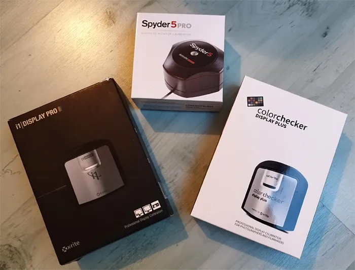
For the rest of this guide the illustrations are made mainly with ColorHCFR 3.5.2 and the Xrite ColorChecker Display Plus colorimeter.
Basic settings: full or limited range
Before starting ColorHCFR there is one basic setting to sort out, both in the PC graphics driver and on the display: the “full” or “limited” range.
In practical terms, a picture is encoded digitally over 3 colours (red, green, blue) on a scale of 256 values, from 0 to 255 in 8-bit (or 0 to 1024 in 10-bit). When all three RGB values are 0 the resulting picture is black. When all three RGB values are 255 the resulting picture is white.
In computing this whole 0-255 range (or 0-1024 in 10-bit) is used, whereas in video (DVD, Blu-ray, TV) only the 16-235 range (or 64-940 in 10-bit) is used. “Full” mode corresponds to the 0-255 working range (or 0-1024 in 10-bit), while limited mode corresponds to the 16-235 working range in 8-bit (or 64-940 in 10-bit).
- If your source is set to “limited” and your display to “full”, the result is a picture with grey blacks and pale whites.
- Conversely, if your source is set to “full” and your display to “limited”, the result is a picture with crushed blacks and blown whites.
To calibrate correctly you therefore need the same range setting on the source (here the PC running ColorHCFR, which sends the test patterns) and on the display: your projector.
If your graphics driver limits the HDMI output to 16-235 (it happens, depending on the graphics chipset) then the projector must be set to limited. Displays (TV or projector) generally switch to the right mode on their own, but sometimes it has to be done by hand.
It is best, whenever possible, to calibrate with both the PC and the display set to 0-255. Whoever can do more can do less, as the saying goes. A calibration carried out on 0-255 transposes to 16-235 without having to change video parameters again.
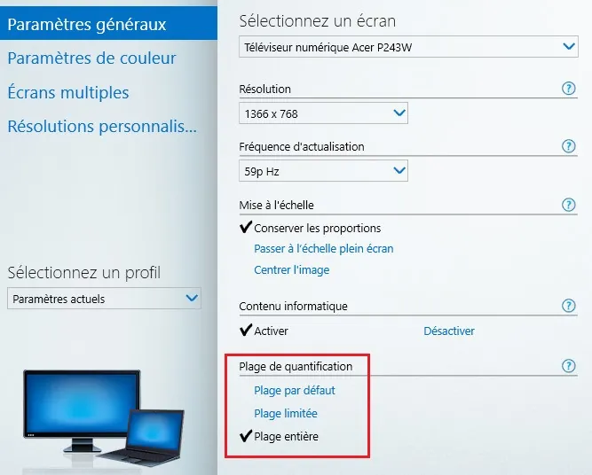
To reach this setting on the PC, the simplest route is usually to right-click the Windows desktop and select the graphics settings.
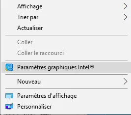
Then go to the section covering graphics settings. Select the screen matching the HDMI output of the graphics card connected to your projector (or to your AV receiver, if it sits between the PC and the display).
The example below is a capture of that screen on PCs fitted with an Intel HD graphics chipset. It shows the choice of “automatic”, “limited” or “full” range.
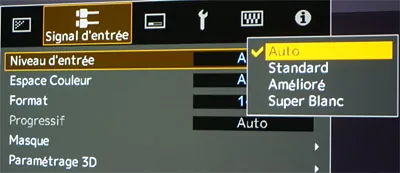
The projector generally has an automatic mode, but it can happen that this mode fails to recognise the 0-255 sent by the PC and stays locked on 16-235. The measurements will then be wrong, especially where gamma is concerned. Below is that setting on a JVC projector. The mode named “Standard” corresponds to the 16-235 range. The mode named “Enhanced” corresponds to the 0-255 range. You will notice a mode named “Super White”, which corresponds to an intermediate 16-255 range. That mode is not recommended.
We shall see further down that ColorHCFR is able to calibrate on 16-235 or on 0-255.
In practice it is recommended to calibrate over the full 0-255 range, with graphics card and projector both set to “full”.
In the test setups used here, connecting a laptop with an Intel HD chipset to an AV receiver and then to a projector (mostly JVC, Epson or Sony), leaving the PC and the projector both in “Automatic” mode used the 0-255 range by default; but it still had to be verified, at the risk of getting the measurements, and gamma in particular, completely wrong.
Setting up ColorHCFR
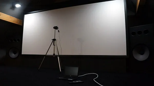
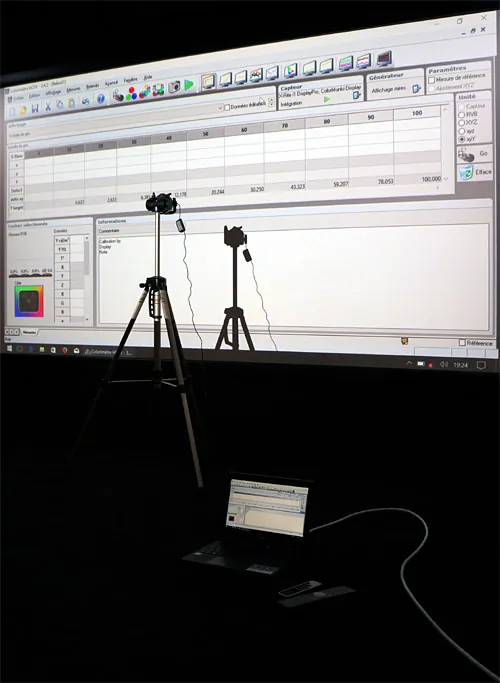
First of all, place the colorimeter correctly in front of the screen. Refer to the documentation supplied with your probe. In the case of the Xrite Display probe it is recommended to face the screen at a distance of about 50 to 60 cm with the cover removed. The cover is meant for measurements taken against a TV or computer screen (ColorHCFR also supports that mode, named “ambient”). Make sure the sensor is not facing its own shadow on the projection screen, or the measurements will be wrong.
Once the colorimeter is connected to the PC you can start ColorHCFR. Select “File”, then “New”. The software offers 2 possible ways of generating the test patterns needed for calibration:
- Either patterns read from an external source (DVD, Blu-ray or UHD player, set-top box, etc.)
- Or patterns generated by the software itself
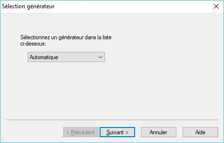
For practical reasons of efficiency and convenience it is the second option to go for. In other words the patterns needed for calibration are generated by the PC itself, hence the importance of having set the limited or full dynamic ranges identically on the PC and on the display beforehand.
The next screen asks you to select the colorimetric probe you want to use for the measurements. If the drivers have been installed correctly your colorimeter should appear in the list.
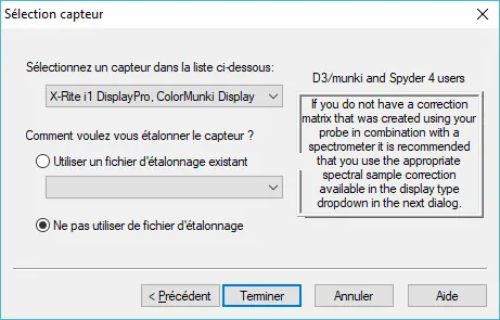
Select it, then click “Finish”. A sensor configuration window opens. The “Reading type” parameter must be set to “Display”. The “Ambient” mode is intended for calibrating televisions with the cover folded back, or for taking measurements with the probe facing the projector, which is not the case here: a calibration has to take the environment, and therefore the screen, into account.
For “Display Type”, select “Projector”.
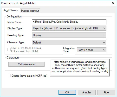
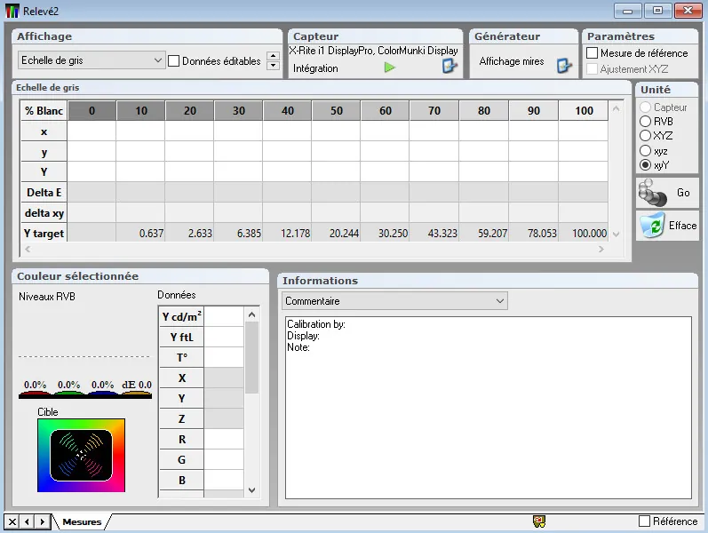
Confirm the settings. ColorHCFR is now ready to take measurements. A tab named “measures”, with empty tables, appears.
Before launching your first measurements the pattern generator has to be set correctly. In the following example the patterns are forced to 0-255, along with a size of 100 % so that they fill the whole screen (field: “Image area”). As described in the previous chapter, if your display is set to 16-235 then the patterns must be generated on 16-235.
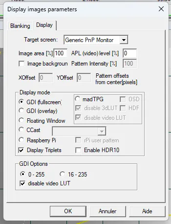
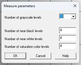
Next, make sure the pattern generator is set to display 10 grey patterns. That number is enough for a calibration, though nothing stops you going up to 20 patterns for finer measurements.
Remember to switch off the lights and cut any residual light before taking your measurements.
There are several video recommendations, but the most widespread, and the one that concerns us in this first section, is the REC709 standard. We shall come to the REC2020 recommendation later.
REC709 is the high-definition standard. It covers video formats up to Full-HD 1080p, from 24 Hz to 60 Hz. It therefore suits many home-cinema uses: Blu-ray, video games, HDTV and so on.
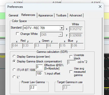
ColorHCFR is set up for the REC709 recommendation out of the box. To make sure, go to the “Advanced” menu, then “Preferences”. In the preferences window, open the “References” tab. The Colour Standard field must be set to “HDTV - REC 709”.
Also, in the “Gamma calculation” section, select the “Standard (black compensation)” mode instead of “ITU-R BT.1886”. The BT.1886 standard imposes a reference gamma of 2.4, whereas the “Standard” or “Display Gamma” mode shows the reference curves for a gamma of 2.2, better suited to projection.
Note that the target gamma can be set manually in the “Power Law Gamma” field.
Calibrating a display breaks down into the following main criteria:
- Colour space
- Gamma (or luminance)
- Colour temperature (measured in kelvin)
- Colour accuracy (hue, saturation, brightness)
It is the correct calibration of these criteria that makes the resulting picture right or wrong. Each of these factors can be corrected independently of the others, although on some criteria they do interact.
Typically gamma as a whole is independent of colour temperature; however, if one of the three colour components of gamma is too far from the other two, you may struggle to set the colour temperature.
First axis: REC709, for HD SDR sources
Choosing the BT709 colour space
On recent projectors you can select different colour spaces, also known as “gamuts”.
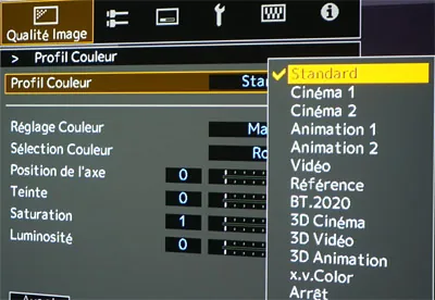
Generally the one closest to the REC-709 recommendation is named simply “BT709” (on Sony or Epson projectors) or sometimes just “Standard” (on JVC projectors). The projector switches to the right colour space mode automatically, but it can also be forced by hand for the duration of the calibration.
Depending on the projector, a more exhaustive choice of colour spaces may be available in the “colour profile” menu.
To check that the colour profile you have chosen is the one that best matches the BT709 standard, run the measurement of the 3 primary colours red, green and blue in ColorHCFR. The software displays in turn the maximum red pattern (R=255, G=0, B=0), maximum green (R=0, G=255, B=0), then maximum blue (R=0, G=0, B=255).

View the colour space thus measured by clicking the “CIE diagram” icon.

The vertices of this triangle represent the maximum saturation the projector can offer for the 3 primary colours. In the example below the coverage of the BT709 space is near perfect: in other words the measurement, the white triangle, sits on top of the reference target, the dark triangle.
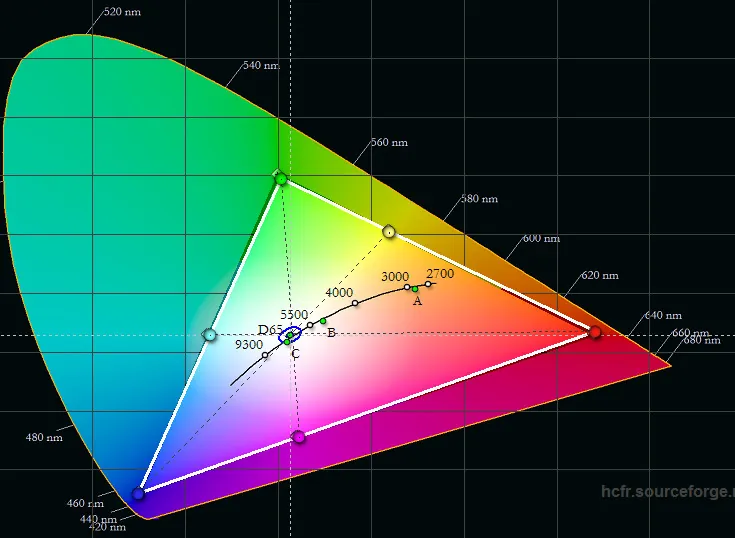
Do try each colour space your display offers, to see the changes on the CIE diagram. Spaces generally named “Digital cinema”, “REC2020” or “HDR” go beyond the limits of the REC709 standard. They are better suited to the new Ultra HD formats, which use a wider colour range.
Below is an illustration of a wider colour space, closer to the REC2020 recommendation. We shall see how it is used later on, as part of REC2020 calibration.
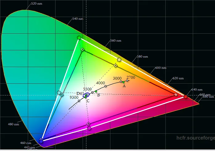
For now, choose the colour mode closest to the REC709 standard. A colour space that is too narrow (that is, a white triangle inside the dark one) gives a picture whose colours are insufficiently saturated. Conversely, a colour space that is too wide (a white triangle outside the dark one) gives a picture whose colours are over-saturated.
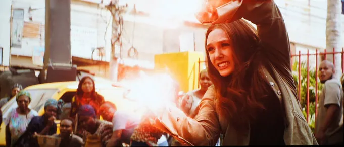
Here is an illustration. The capture below, from a 1080p BT709 Blu-ray film, shows the projector set on the BT709 basis:
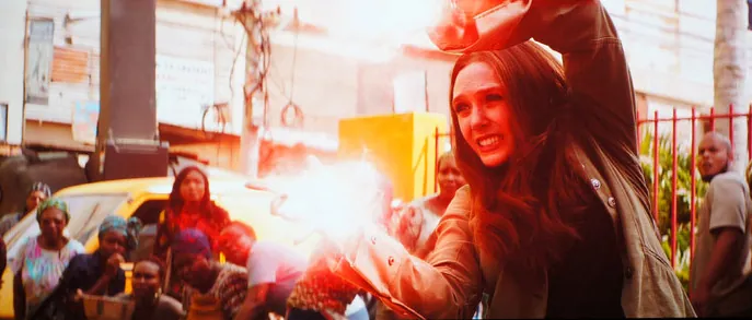
And here is the result if a wider BT2020 gamut is selected on the display. The red level is far too saturated and the resulting picture no longer looks natural.
We shall see in the chapter devoted to saturation settings that, once the right colour space has been chosen on your display, every setting you can act on will only change what lies inside the measured triangle.
Measuring the black floor, brightness and contrast
Before tackling gamma we need to cover 3 notions.
- The black floor: this is the brightness measured on a completely black picture (that is, the 0 IRE pattern). The lower it is, the denser the black your display produces. Depending on the sensitivity of your colorimeter you may not be able to measure this value at all (typically the ColorChecker Display Plus or Xrite i1Pro probes are only sensitive down to 0.004 nits, a value few projectors reach).
- Maximum brightness: this is the brightness value on a completely white picture (that is, the 100 IRE pattern). The higher it is, the more dynamic and luminous the picture.
- The on:off contrast is the result of dividing the maximum brightness by the black floor.
It follows that the lower the black floor and the brighter the whites, the higher the resulting contrast.
Treating the environment (walls, ceiling, floor) also plays a leading part in the measurements. The darker the room, and therefore the more light it absorbs, the lower the black floor and the higher the contrast. For one and the same projector, contrast can easily double or triple between a bright room and a treated one.
Of course, if the black floor could not be measured, the division by zero cannot be performed and the contrast will not be displayed, which in the end is the sign of an excellent black level. Contrast then shows as “?”.
With the Xrite probes, and save for rare exceptions (very high light output), the black floor of JVC projectors using D-ILA technology could never be measured here. All the other projectors (SXRD, 3LCD or DLP), on the other hand, have an easily measurable black floor and therefore a contrast figure that can be calculated.
These 3 values are given by ColorHCFR once the greyscale patterns have been measured. To do so, click the icon below.

Here is an example of the result obtained after measuring the 10 greyscale steps. In this illustration the black floor in column 0 was measured at 0.012 nits, maximum light output at 50.861 nits and the resulting contrast at 4411:1, which is indeed the ratio 50.861 nits / 0.012 nits.
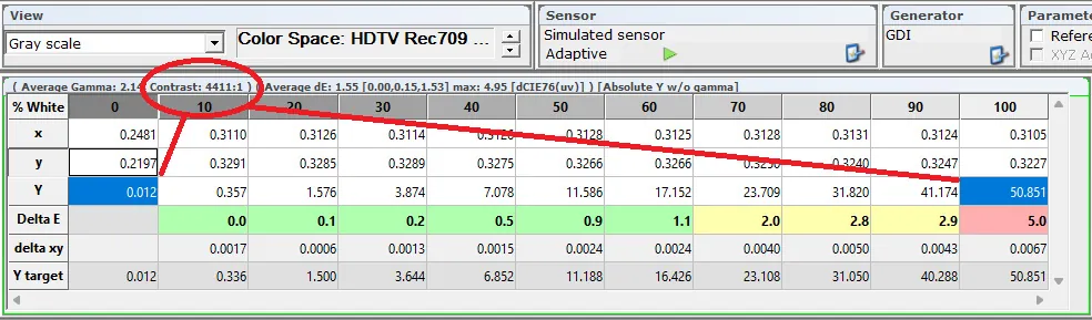
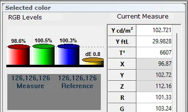
As you can see, ColorHCFR shows the result in cd/m2 (candela per square metre), more commonly called “nit”. The value can also be shown in foot-lamberts, an older unit largely replaced today by the nit. 50 nits is roughly 15 fL; 100 nits is roughly 30 fL, and so on.
If you click a column in the table, the section below on the left, named “Selected color”, fills in. The first value, Y cd/m2, is the brightness of the selected pattern in nits. The second is the brightness of the selected pattern in foot-lamberts.
You will probably notice while measuring that the more you raise brightness, whether through laser power or lamp power, the more you risk raising the black floor. The phenomenon is all the more visible the smaller the projected image. In short, what is gained in brightness is sometimes lost in the depth of the blacks. The whole point is to find a compromise that preserves the visual comfort brightness brings, blacks that are deep enough, and the contrast that results.
Note that your display may have dynamic settings that reduce the black floor. That is the case in particular of the iris setting (manual or dynamic control), or dynamic laser modulation on projectors fitted with that light source. Do try switching these mechanisms on to see the effect on the measurement of black floor, brightness and contrast. On some units dynamic laser modulation halves the black floor (so black is twice as dense on a completely black picture), or even removes it entirely by shutting the laser off, in which case one speaks of infinite contrast since the brightness of the black pattern is zero. Beware of side effects, though, such as the pumping seen on transitions between a dark and a bright picture.
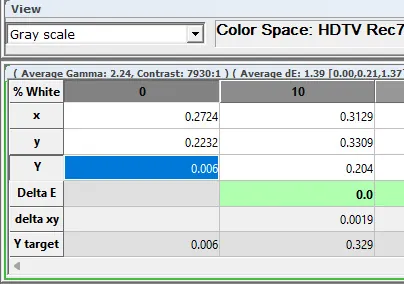
In the example below it is still the same projector, but with the dynamic laser enabled at low speed, and the effect on the measurement is already considerable: the black floor has fallen to 0.006 nits and contrast has risen accordingly.
For the rest of the calibration it is nevertheless advisable to switch off temporarily every dynamic device such as dynamic iris, dynamic laser, adaptive gamma and so on, because their influence, on greyscale values in particular, is often visible and prevents a clear reading of the measurements.
But nothing stops you switching them back on once the calibration is finished.
Brightness and black floor values will also move as calibration progresses. Very often colour calibration leads to a slight loss of brightness. We shall come to that in the chapter devoted to colour temperature (that is, white balance).
For the REC709 recommendation in projection, the standard would have us aim for 50 to 60 nits of brightness in a dedicated room (with dark surfaces). But screen width and the distance between screen and viewer have to be taken into account. In practice, where 50 nits offers welcome comfort on a 3.5 m wide image, it remains insufficient on a 2.5 m width, for which one can aim higher and get closer to 80 nits, say.
In HDR REC2020, on the other hand, the more brightness you have in reserve, the better the result.
Setting the gamma
For REC709 calibration it is always preferable to start with gamma. It makes setting the white balance easier.
Gamma, or luminance, is also called the contrast factor. It is the non-linear amplification applied to the video signal to obtain a satisfying result at the output. In concrete terms, and without going into complex equations, the higher the gamma the darker the picture. Conversely, the lower the gamma the brighter the picture.
In the case of the REC709 recommendation, the standard would have gamma calibrated to 2.4.
In a home-cinema context, however, and mainly in projection, aiming for a gamma of 2.2 is preferable. It is no accident that every projector on the market most often has its default gamma calibrated towards 2.2 rather than 2.4.
That said, nothing forbids you from calibrating towards a gamma of 2.4, especially if your display has plenty of brightness in hand (closer to 100 nits than to 50). It is easy enough to compare the two settings on the fly, on films, and pick the one that suits you best.
What matters first and foremost is the linearity of gamma as measured, in other words having no dips or humps.
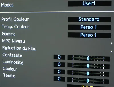
Contrary to received wisdom, the contrast and brightness controls on your display are not there to perfect the gamma setting. Those 2 controls are mainly there to set the maximum black and maximum white of your display properly. As a rule, projectors are rarely off on that point, and the settings generally need little or no attention.
Examples:
- 0 for brightness and contrast on a JVC projector (see the capture below)
- 50 for brightness and 100 for contrast on a Sony projector
- 50 for brightness and contrast on an Epson projector
Do try it: raise brightness by a point or two, run a greyscale measurement, and you should see your black floor rise and your contrast fall as a result.
If you change the brightness setting you shift your black on the 0-255 (or 16-235) space. The same goes for the contrast setting, which shifts your white.
In the end, if you find your picture crushed in the blacks, it is indeed the correct gamma setting that should solve the problem.
Before anything else, switch off the dynamic control processes such as dynamic iris, dynamic laser or adaptive gamma if your projector has them. In the example below the iris is switched off (manual mode enabled).
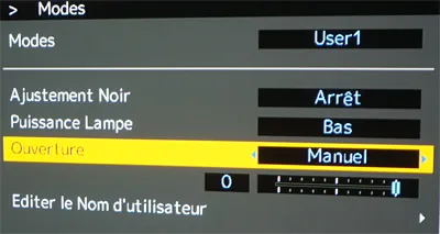
Calibrating gamma is done by running the greyscale patterns in turn, from black to white. Click the following icon.
You can then view the result in 2 ways: either through the Luminance graph or through the Gamma graph.
The Luminance graph is reached by clicking the following icon.

Here is the resulting luminance curve in SDR. In the example below the measured curve (in yellow) sits almost exactly on the dotted white target curve, the sign of a good gamma setting.
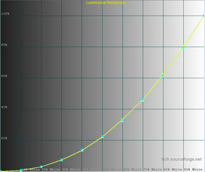
That curve is not necessarily easy to read, though, and most of the time the Gamma graph is preferred.
To view the result of the gamma measurement, click the “Gamma graph” icon.

You then get a curve that is far easier to read. In the example below the curve sits slightly below 2.2 but is broadly straight, which is already a good starting point. Concretely, if the curve is above 2.2 on the left-hand side you will have denser blacks, but also potentially more crushed ones. If the curve dives on the right you will have more dynamic whites, but potentially more blown ones.
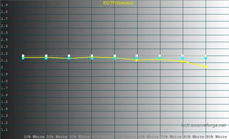
What we are after is to bring the measured curve (the yellow one) closer to the 2.2 standard shown as a dotted white line. Your projector's own gamma setting lets you raise or lower the whole curve. Sometimes, to get a straight line closer to 2.2 as measured, you have to choose 2.3 or even 2.4. Example below:
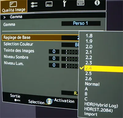
But you will find that the corrections needed, if any, are generally at the extremes, that is in the black levels (left-hand side of the curve) and the white levels (right-hand side). In the example above, taken on a JVC projector, the dark-level and bright-level settings are the ones to use to correct the curve on its left and right sides respectively.
- The higher the dark level, the more the curve drops on the left-hand side (black levels).
- The higher the bright level, the more the curve drops on the right-hand side (white levels).
If you are starting out, be methodical: change one setting at a time, take another greyscale measurement and look at the effect on the curve, until you converge, after several iterations, on the best result.
Below is an example of the luminance and gamma curves you should be converging towards after a few adjustments.
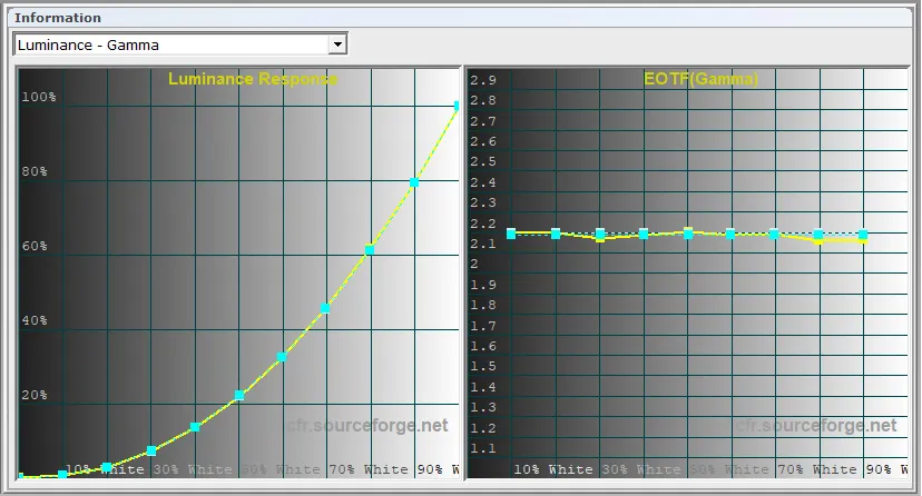
Depending on the projector it is sometimes possible to have gamma settings per primary colour, which allows finer adjustment.
That is an option usually found on JVC projectors. In the example below the white gamma is selected (it corresponds to the yellow measurement curve). But the user can choose any one of the three primary colours: red, green or blue.
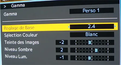
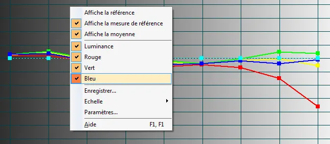
Use these individual per-colour settings in order to smooth the white gamma curve (that is, the yellow curve on screen). To display the R, G and B gamma curves on screen, right-click the graph.
It is not absolutely necessary to have the 3 RGB gamma curves perfectly aligned on 2.2 in the same way as the yellow curve, but the closer they are to one another, the easier it will be to correct colour temperature afterwards.
In the example below you can see that the red gamma falls too quickly in the high IRE values. Lowering the “bright level” of the red gamma is enough to reduce the gap.
A short aside about JVC projectors. The manufacturer provides an autocalibration program, available at this address.
If you find that your gamma curve is off-standard, typically choosing 2.2 on the projector but measuring 2.4, or that the R, G and B gamma components are too far apart, using that program ahead of the ColorHCFR calibration is strongly advised. It is a very practical tool, which recalibrates gamma independently of colours and gamut. Each generation of JVC projector has its own version of the software, and its own list of compatible colorimeters: generally the Spyder X or 5, or the Xrite Display Pro2.
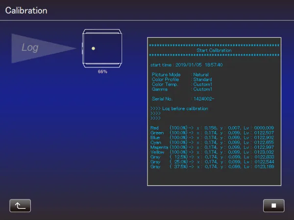
Below, an autocalibration carried out with a Spyder 5 colorimeter, which has to be placed facing the projector at a distance set by the JVC software.
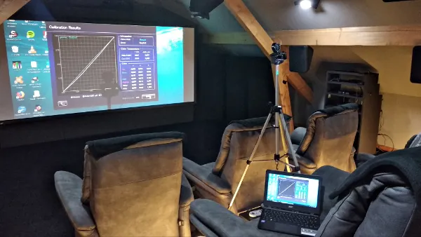
The JVC autocalibration software at work:
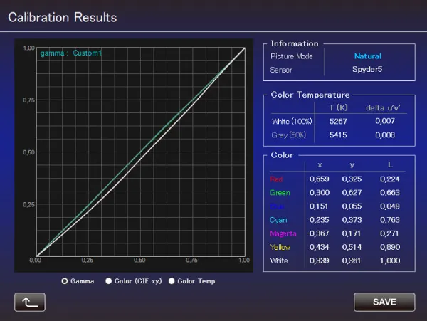
An example of the SDR gamma curve corrected by the JVC autocalibration software:
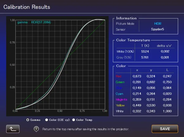
An example of the HDR luminance curve corrected by the JVC autocalibration software:
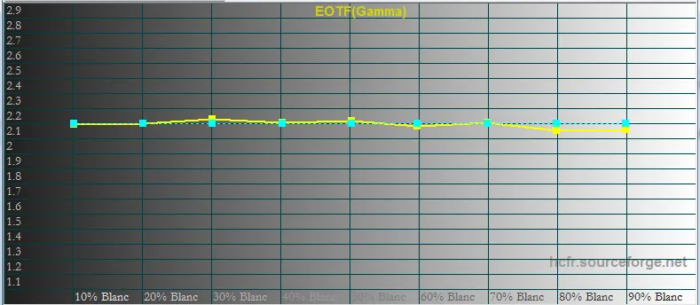
Here is an illustration of a result obtained after autocalibration through the JVC software. The gamma 2.2 selected on the projector gives a nicely linear 2.2 as measured. A very effective tool, and sometimes an indispensable one, since it is more precise than the settings the user can reach in the projector menu. It is software to be used with care, as it changes the projector's internal values, so remember to keep the backup file it generates. It is worth using mainly for gamma calibration, even though it can handle colours as well.
Sony also offers a tool called “Projector Calibration Pro”. It is software normally reserved for integrators or calibrators, but the customer can ask their dealer for it. Like the JVC program it gives access to advanced settings, gamma among them.
As with JVC projectors, communication between the PC and the projector goes through the RJ45 port on the projector. Once the projector is on the local network, the software connects by entering its IP address.
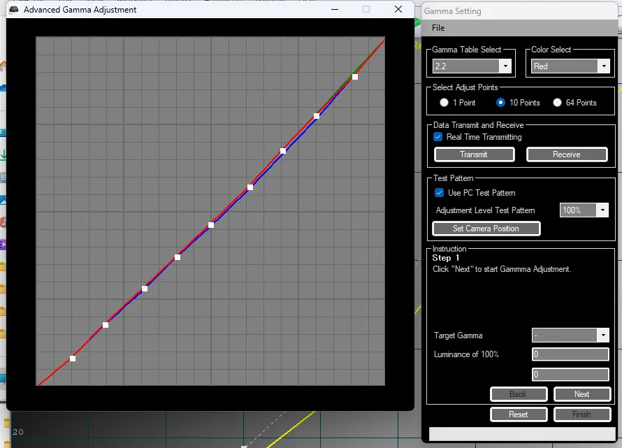
It is software to be handled with care, since the projector's presets can be overwritten. An extremely rich tool, of which only one setting is covered here, the one named “Advanced Gamma Adjustment”.
As you can see in the capture below, you can choose from a list of gamma tables. It is the same list as the one available in the projector, running from gamma 1.8 to 2.6 plus the additional curves 7, 8 and 9.
The software allows the curve to be corrected over 10 points, or even 64 points. That correction can be applied at the white level or per RGB component. In the example below it is the red gamma being modified.
What is more, ticking the “Realtime Transmitting” box sends the changes straight to the projector, which makes corrections easier.
Below is an illustration of the gamma measurement in the 2.2 position on a Sony projector. By default the measurement on this unit does not give a perfectly linear gamma, with an average of 2.05 and a blue that diverges from the red and green gammas.
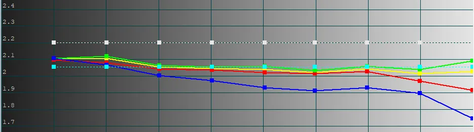
And here is the result after a few corrections using the Sony software: an average gamma of 2.2 and components that overlap far more closely. Better colour-temperature calibration will follow (see the next chapter).

Let us close this short parenthesis on the JVC and Sony calibration tools and return to SDR gamma calibration.
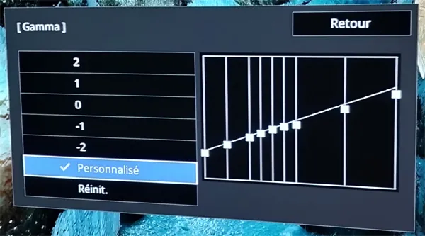
Some projectors offer point-by-point gamma correction in the form of a Luminance curve over several greyscale values, as shown below. That correction proves far more precise.
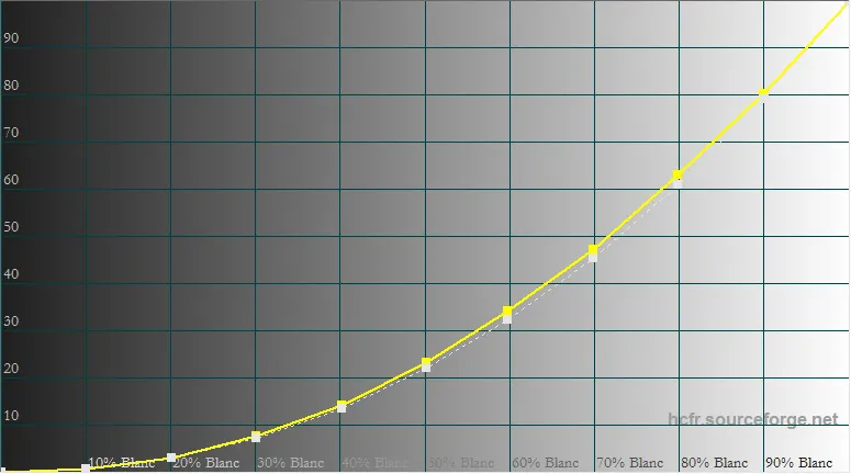
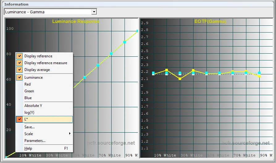
That curve, also known as L*, is more representative of the perceived brightness of a picture: it forms a straight line from black (the darkest picture) to white (the brightest).
Illustration on a JVC projector:
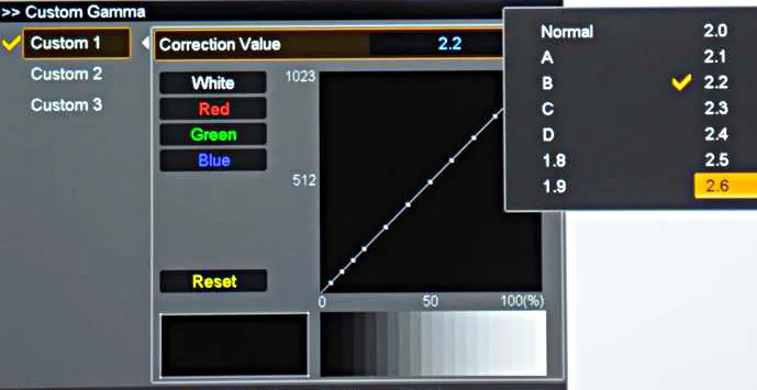
Illustration of point-by-point gamma adjustment on an Epson projector:
Using the luminance curve may then prove more appropriate for fine-tuning. Here too the aim is to have the measured curve in yellow sit on top of the dotted white reference curve.
Still on that same graph, you can display the L* curve by right-clicking the screen and selecting L*. You will notice other parameters as well, such as curve scaling, which can be handy for reading the values on screen more easily.
Change the values step by step to get a feel for each of the display's gamma-related settings, and do not hesitate to run several measurements to converge on the result you want.
To sum up:
- A gamma set wrongly on the left-hand side of the curve leads either to a picture with crushed blacks (gamma too high) or washed-out blacks (gamma too low)
- A gamma set wrongly on the right-hand side of the curve leads either to a picture with pale whites (gamma too high) or blown whites (gamma too low)
The following curve shows a good calibration, with an average gamma of 2.2.

Going back to the measures tab, you will see that the table has filled in, with the average measured gamma shown at the top left next to the calculated contrast.
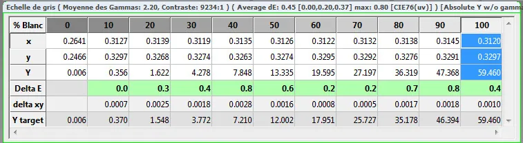
The following curve shows a slight downward slope and an average gamma of 2.16. That is not necessarily a deal-breaker, in the sense that it gives a picture with dense blacks and dynamic whites. The opposite, a rising curve, would have been less good (less dense blacks and less dynamic whites).

Besides, if your projector is not bright enough you can sometimes settle for a gamma slightly below 2.2 to make up for that weakness. Conversely, if you have brightness to spare you can try aiming for a target gamma of 2.4.
As for brightness, if you find it too high it means your display has a good reserve of light output. You can then:
- Reduce lamp or laser power (that is, switch to ECO mode)
- Play with the manual iris to lower brightness and gain contrast, if the projector has one
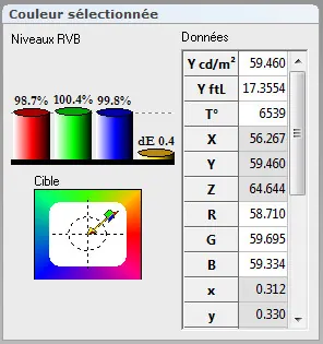
In the example below the 100 IRE white pattern gives a brightness of almost 60 nits (that is 17.35 fL), already a good basis for SDR
Setting the colour temperature
Once gamma is sufficiently well set you can move on to calibrating the levels of the 3 primary colours. You will find that a good RGB level setting leads to a good temperature setting at 6500 K.
As with the gamma setting, the 10 greyscale patterns have to be run in order to measure RGB levels and colour temperature. In computing, the colour grey has the particular property of containing the 3 primary colours RGB in identical proportions. Typically the 10 IRE pattern contains 10 % red, 10 % green and 10 % blue. It is now easier to see why those patterns are useful for calibrating the levels of the three primary colours in equal quantities.
The corresponding measurement curves are displayed by clicking the “RGB levels graph” and “Colour temperature graph” icons respectively.


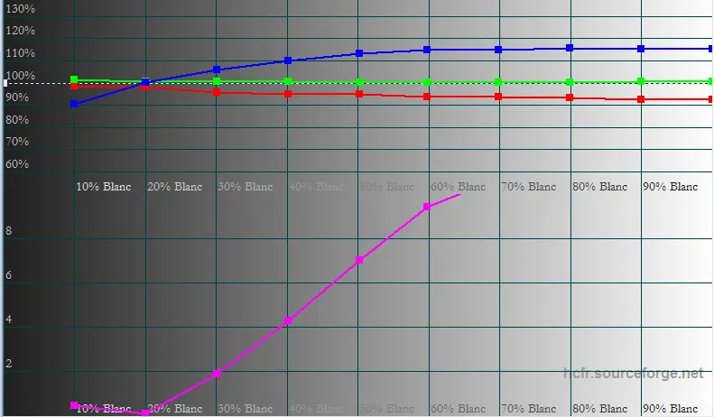
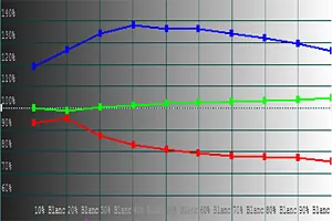
Below is the uncalibrated RGB levels graph. As is very often the case out of the factory, one can see a blue cast, which translates into a cooler picture.
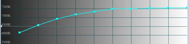
Here is the resulting colour temperature graph, which is therefore not linear on the 6500 K standard. In this instance a cooler temperature, pointing towards 7500 K.
To begin with, concern yourself only with the RGB levels graph.
On the display, the settings that act on these curves are the following:
- Colour temperature: preferably choose a preset close to 6500 K, so as to have the least correction to make.
- RGB levels: made up of 6 settings, that is 2 per primary colour, one for brightness and one for contrast. Depending on the projector model they are named “Bias” or “Offset” on the one hand and “Gain” on the other. Offset or bias acts on the left-hand side of the curve (that is, the brightness level) and Gain on the right-hand side (that is, the contrast level)
Gain and offset settings on a JVC projector
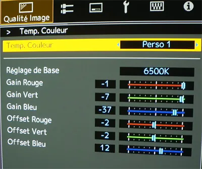
Gain and bias settings on a Sony projector
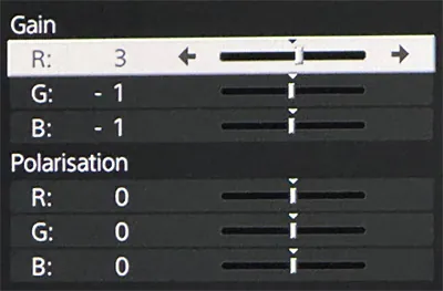
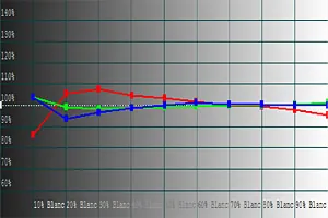
The aim of calibration here is to make the 3 RGB curves overlap. Concretely, if the blue curve sits above the others the picture will be too cool, with a blue cast. If the red curve sits above the others the picture will be too warm. Visually the eye accepts a slight blue cast, as found on many projectors out of the box, more readily than a green one.
Below the 3 curves you will notice a curve named DeltaE. That curve represents the gaps between the 3 colour levels. The lower it is, the better the result. As a rule, when Delta E is below 4 an untrained eye can no longer see the differences. Wherever possible, aim to stay below 2 over the whole DeltaE curve.
Before setting the levels

After setting the levels

Since you have to run the same greyscale patterns to set colour temperature and gamma, do go back to the gamma screen to check the curve. In theory it should not have moved.
On the measures screen, on the other hand, brightness has probably fluctuated, or even fallen. Typically on a JVC projector the gain of the three RGB primaries is set by necessarily lowering their levels (the 3 gains being at maximum by default), so once the levels are properly adjusted brightness will drop. Likewise, do check that the black floor has not been affected too much by the bias setting on the primaries: raising the bias or offset of one or more of the 3 primaries raises the brightness of black, and therefore the black floor, and by the same token lowers the contrast of the picture.
These settings should therefore be used even-handedly: if you raise the bias of one primary, try to compensate by lowering the bias of another, to find a fair balance and avoid lowering the contrast of the picture.
Typically, in the following illustration, red is at fault. This is a lamp-based projector with a few hundred hours behind it. The wear of the lamp over time has lowered the red level relative to green and blue. One would therefore be inclined to raise the red gain and the red bias. But in this instance it would be just as good to compensate by lowering the green and blue bias together with the rise in red bias, so as not to raise the black floor and thus preserve the contrast of the picture.
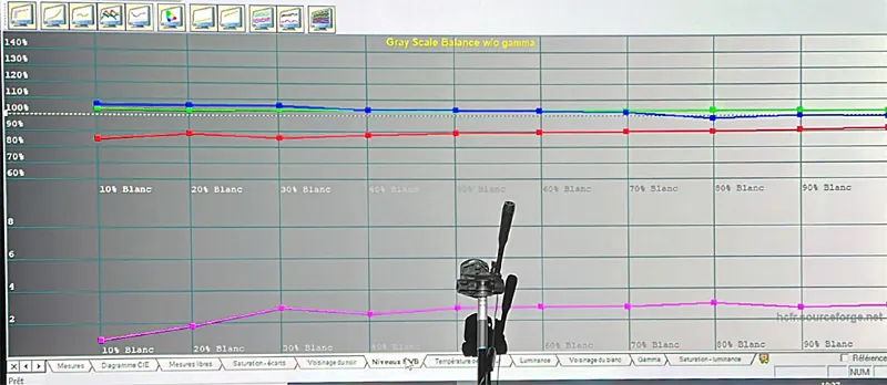
Once the 3 curves are more or less superimposed (that is, DeltaE < 2 over all 10 IRE patterns) you will notice that the colour temperature graph sits on 6500 K.
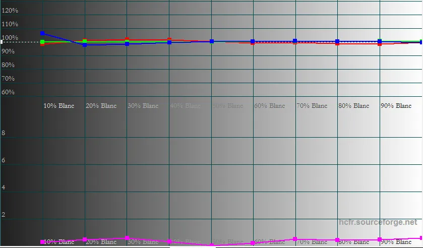
Below is the resulting colour temperature graph, now close to 6500 K over the whole greyscale, which shows that the RGB levels are correctly set.

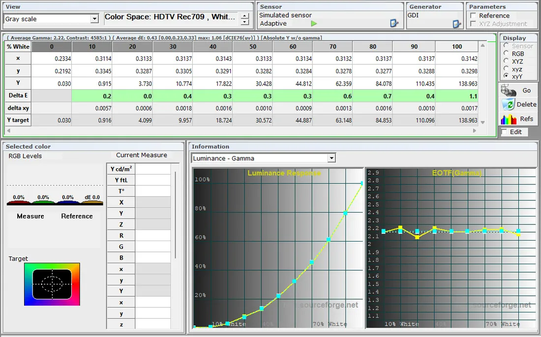
Finally, go back to the first measures screen. You will logically see that your gamma curve has not moved. Besides, in the measurement table you can read the Delta E values just below the brightness (Y) values. The cells are green if the values are correct, and orange or red if DeltaE is too high.
Setting the saturations
We have just set the colour temperature to 6500 K so that the 3 primary colours RGB are in identical proportion over the whole brightness scale, from black to white.
Now we are going to set colour accuracy. In other words the saturation, brightness and hue of the colours within the space covered by the CIE triangle we illustrated above.
Besides the 3 primary colours, the 3 secondary colours cyan, magenta and yellow, also known as “CMY”, come into play. It is the mixing of primary colours that gives the secondary ones:
- Mixing red and green gives yellow.
- Mixing green and blue gives cyan
- Mixing blue and red gives magenta
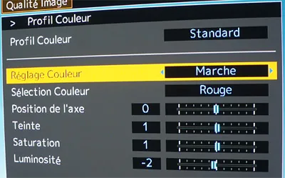
To make these adjustments the projector must have colour management, often called “RGBCMY”, “Colour Management” or indeed “Colour Profile”.
Below is the corresponding setting on Epson projectors.
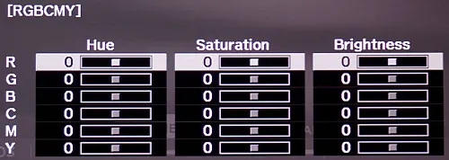
Below is the corresponding setting on JVC projectors.
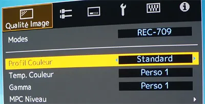
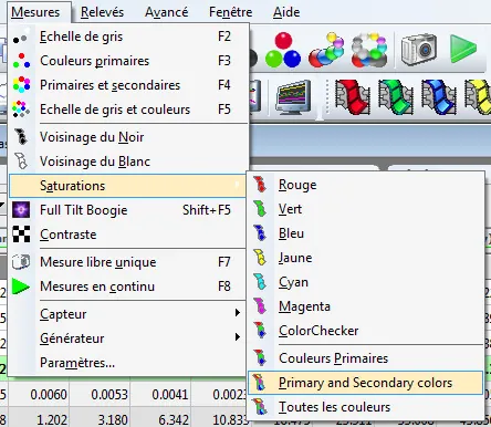
In ColorHCFR, to measure these colours, go to the “Measures” menu, then “Saturations”, and select “Primary and Secondary colors”.
The software runs 4 saturation patterns for the 6 primary and secondary colours.
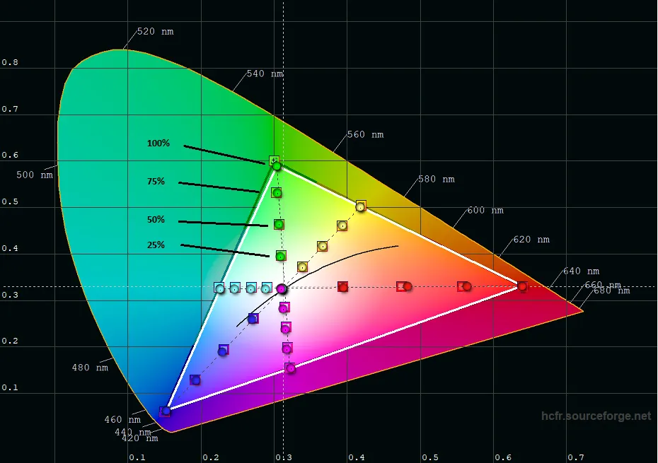
Those 4 patterns represent saturation at several levels:
- 25 %
- 50 %
- 75 %
- 100 %
To view the result, go back to the CIE diagram. You will see new measurements, represented by the patterns that were played.
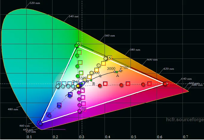
The vertices of the triangle correspond to a saturation of 100 % for each colour. That was set when the REC709 gamut coverage was chosen at the very beginning of the calibration. The settings we are about to use, on the other hand, aim to correct the saturations inside the triangle, that is at 25 %, 50 % and 75 %.
The illustration below shows the saturation levels of each green pattern.
In concrete terms the accuracy of a colour is determined by 3 fundamental parameters:
- Its hue
- Its saturation
- Its brightness
Setting the hue of a colour means changing the position of that colour among all the colours that can be represented on a colour wheel.
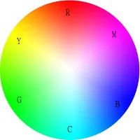
Changing the hue of yellow by a small amount can push it either towards red or towards green. Changing the hue of yellow by a large amount, for instance to the opposite side (that is, 180°), can push it towards blue. Obviously, in the case that interests us, the adjustments are small.
The following diagram shows the effect the green hue setting will have on the measurement of the green saturation patterns. In this example the green hue therefore has to be reduced to bring the measurements back inside the targets.
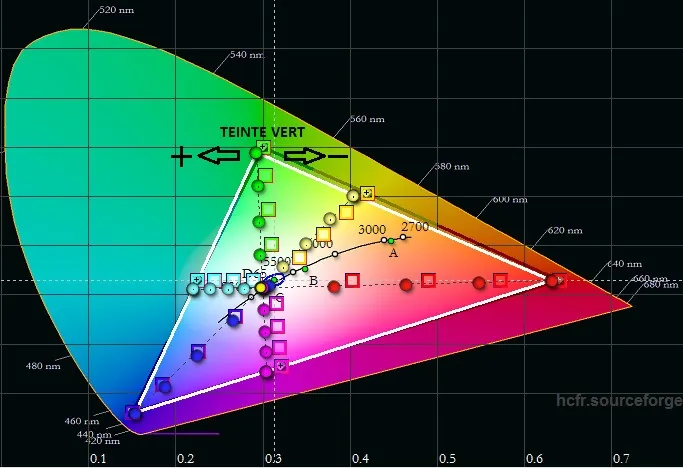
Still in this example, reducing the cyan hue will realign the cyan saturation measurements with the targets. Likewise, raising the magenta hue will realign the magenta saturation measurements with the targets, and so on.
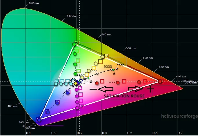
Changing the Saturation of a colour means making that colour more or less dense. A picture in which the saturation of every colour is set to minimum gives a black-and-white picture. On the CIE diagram, the higher the saturation value of a colour, the further its saturation-pattern measurements move towards the edges of the triangle. As with the colour wheel illustrated above, the edges of the triangle represent the maximum saturation level of each colour. Conversely, the lower the saturation level of a colour, the further its saturation-pattern measurements move towards the centre of the triangle.
The following diagram shows the effect the red saturation setting will have on the measurement of the red saturation patterns. In this example the red saturation therefore has to be raised to bring the measurements back inside the targets.
Changing the brightness of a colour means making that colour lighter or darker. A picture in which the brightness of every colour is set to minimum gives a black picture. Conversely, a picture in which the brightness of every colour is set to maximum gives a white picture.
In the previous example, raising the brightness of red will move the red saturation-pattern measurements closer to the centre of the triangle (that is, to white). It acts, in a way, in opposition to saturation. But brightness is best approached as a 3rd dimension juxtaposed with hue and saturation. That amounts to modelling the colours of the colour wheel illustrated above no longer as a flat disc but as a sphere whose vertical axis is brightness.
ColorHCFR also offers a diagram representing the brightness of the colours, reached by clicking the following icon.

You will notice that the colours are ordered by brightness, the darkest being blue and the lightest yellow. Use the brightness setting of each colour to bring each curve closer to the standards shown as dotted lines. But remember to check the effect on the CIE diagram regularly: when the brightness of a colour is lowered, its saturation sometimes has to be raised in compensation.
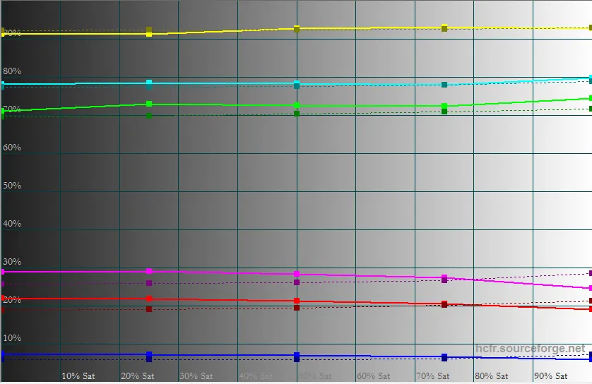
The combination of the 3 parameters we have just covered (hue, saturation and brightness) therefore allows the “accuracy” of the colours to be corrected. The saturation-error diagram for the 6 RGBCMY colours also lets you check which colours most deserve correction. It is reached by clicking the following icon.

That diagram is akin to the RGB levels one.
- At the top, the aim is to make the 6 curves overlap as closely as possible.
- At the bottom, the corresponding DeltaE for the errors is shown. The lower the value, the better the result. As with the colour-temperature DeltaE, the 6 curves should preferably stay below 4.
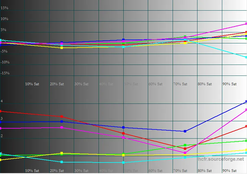
The whole difficulty of saturation calibration therefore lies mainly in the right balance between the 3 parameters hue, saturation and brightness.
Do display all 3 graphs (CIE diagram, Saturation - luminance and Saturation - errors) and watch on each of them the effect of the settings applied after every new measurement.
Here is an illustration of the result on the three graphs once saturation calibration is done.
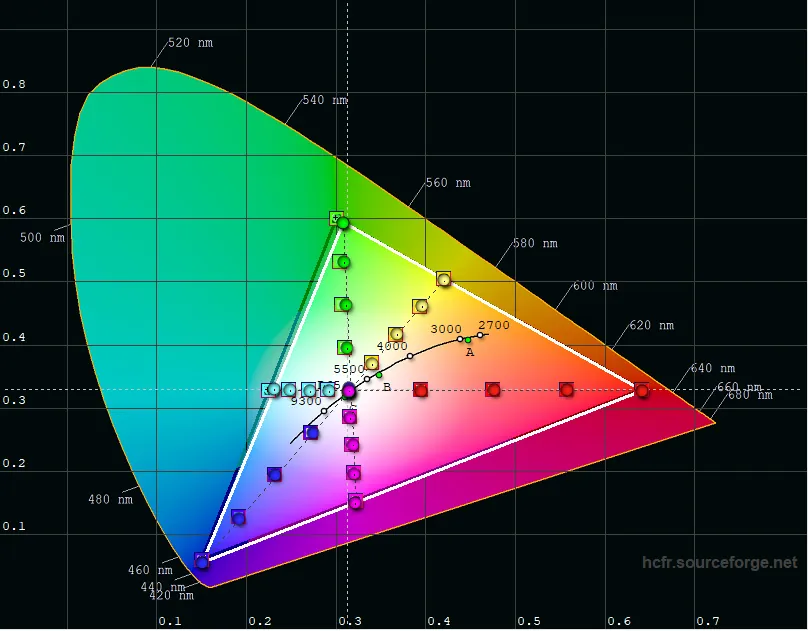
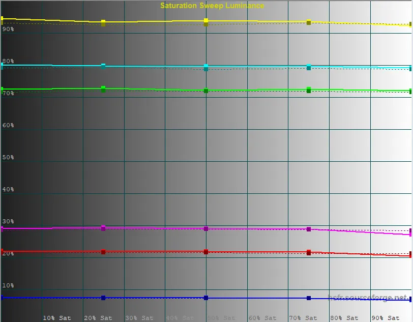
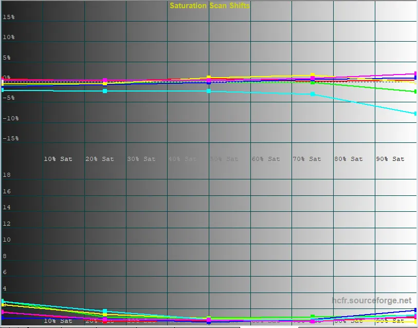
Finally, the ultimate judge of colour accuracy is the “Color Checker”. These are complementary saturation patterns, reached from the following menu.
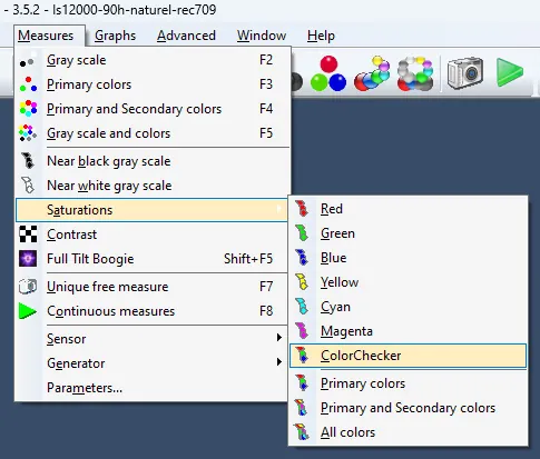
You can view the result on the CIE diagram by displaying the ColorChecker targets and measurements (right-click the screen). They appear as targets (squares) and measurements (discs) in white on the graph. Their close superposition confirms the quality of the calibration carried out, as the example below shows.
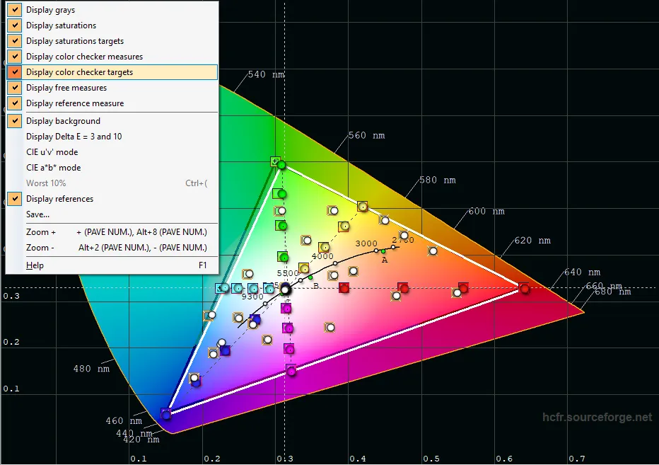
At this stage the REC709 calibration (for SDR sources, 1080p Blu-ray, HDTV) can be considered finished.
To recap, we have calibrated gamma, colour temperature and colour accuracy on the BT709 gamut. On top of that, ColorHCFR shows the maximum brightness, the black floor and the resulting contrast in the measures tab.
Do not forget to save the result of all these settings in a memory of the display dedicated to that use. In the following chapters we shall turn to REC2020 settings, namely the BT2020 gamut and HDR luminance.
Second axis: REC2020, for UHD HDR sources
Choosing the BT2020 colour space
Every display is able to reproduce the REC709 standard more or less correctly. But where the REC2020 standard associated with UHD and HDR is concerned, that is quite another story, particularly in projection, where concessions will have to be made.
That said, over the following paragraphs we shall see how to optimise certain settings in a REC2020 context associated with HDR gamma.
Unlike REC709 calibration, this time we shall work the other way round: setting saturations on the BT2020 colour space first, then the white balance (that is, the colour temperature setting), and only last the gamma, or more precisely the HDR luminance governed by the ST2084 standard.
First of all, ColorHCFR's parameters have to be changed to switch to REC2020. Select the standard “UHDTV REC2020”. At this stage, do keep the gamma setting in SDR.
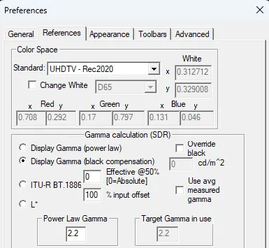
Confirm the preferences, then go back to the CIE diagram. You will see that the reference CIE triangle is far wider than in REC709.
On your display, the BT2020 colour space, or whichever comes closest to it, has to be forced manually for the duration of the measurements. Below is an illustration of the colour-space choice on an Epson projector.
Then run the measurements of the RGBCMY primaries and secondaries through the following icons:
You will also see that the measured triangle falls a long way short of the REC2020 standard. Few consumer projectors offer 100 % coverage of the BT2020 gamut; at best, coverage approaching the DCI-P3 standard.
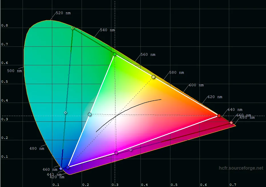
You can check that by going back into ColorHCFR's preferences and selecting the standard “UHDTV - DCI P3”.
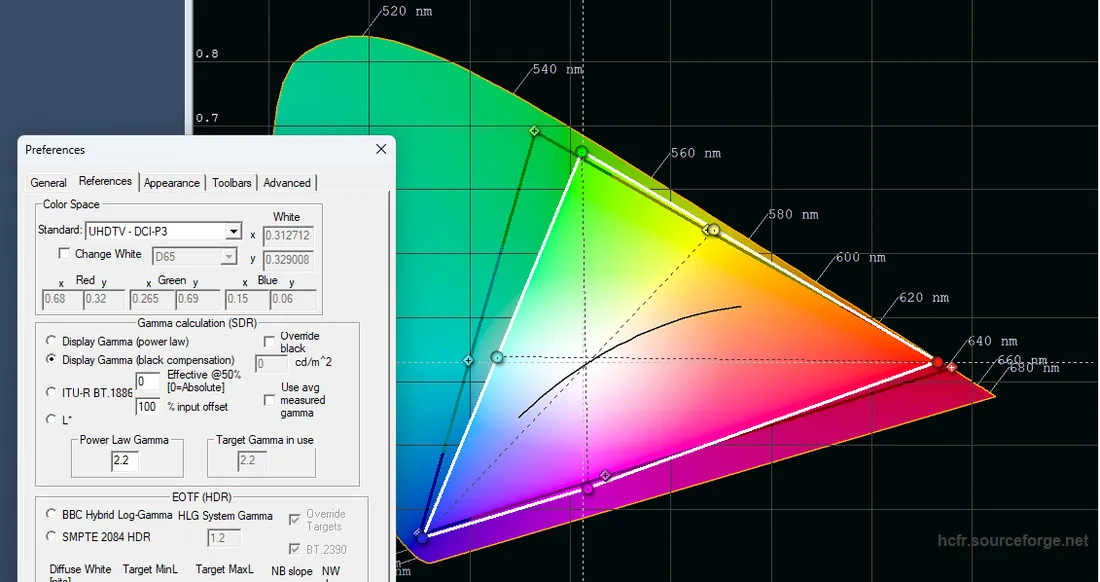
For the rest of the calibration, remember to return to the “UHDTV REC2020” standard.
Note that some high-end projectors offer wider BT2020 colour filters. An example below with a JVC laser projector and its “BT2020 - wide” colour mode. As measured, full DCI-P3 coverage is achieved. The flip side is that using such a filter generally costs brightness.
To check that, run the greyscale measurement again and look at the effect on brightness on the white pattern. In this instance, switching the wide BT2020 mode on cost nearly 30 % of the brightness. Its use should therefore be reserved for modest image widths. It is worth keeping in mind that the human eye is more sensitive to brightness than to richness of colour.
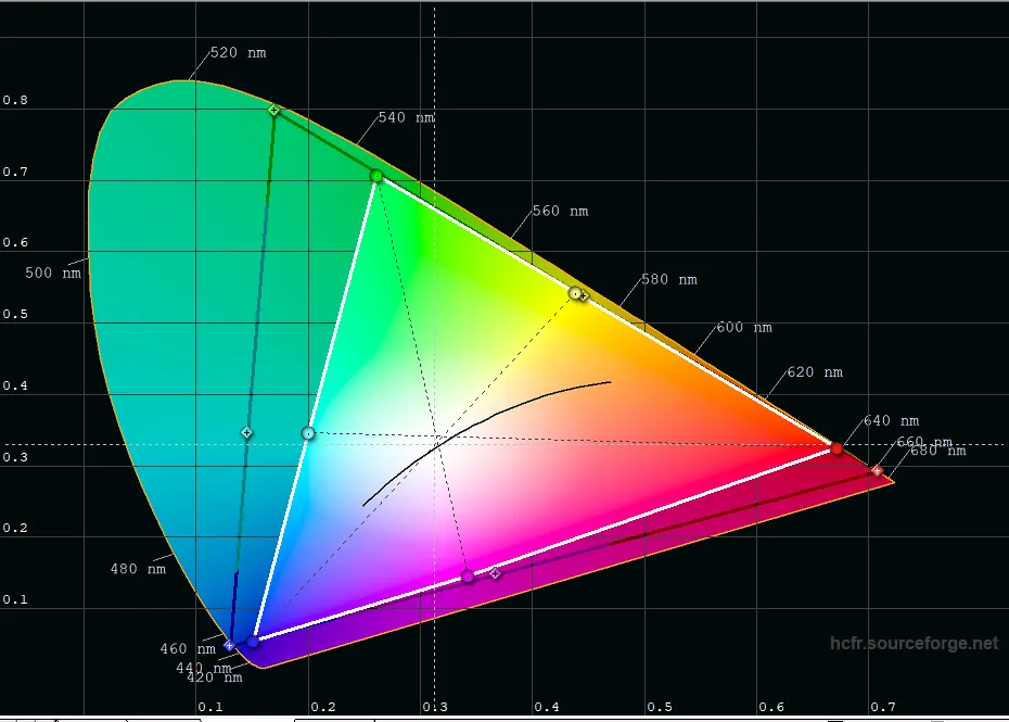
Once your BT2020 colour space is selected on the projector we shall calibrate saturations exactly as we did in the previous chapter, that is by running the saturation patterns for the primary and secondary colours.
You will quickly see the limits of the corrections you can make. Every target saturation that falls outside the limits of the measured CIE triangle cannot be corrected. Concretely, you can only correct the saturations of colours that lie inside the measured triangle. In practice green generally cannot be corrected beyond 25 %. Yellow can be corrected up to 75 % and red usually up to 50 %, and so on. See the illustration below.
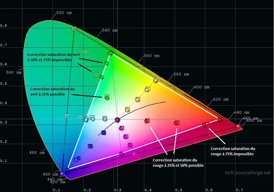
Proceed in the same way, making the measurements (the circles) overlap the targets (the squares) as closely as possible.
From the measurements taken on several projectors, if the REC709 saturation calibration was done properly beforehand, then the corrections needed on the REC2020 saturations will be fairly small, or even non-existent.
Example below on a BT2020 gamut that only partly covers DCI-P3, with broadly good saturations.
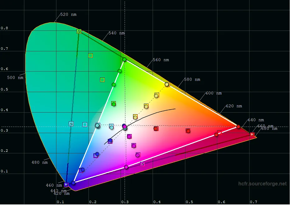
Another example below, on a gamut that does cover DCI-P3. Here green saturation can be set up to 50 % and red saturation up to 75 %.
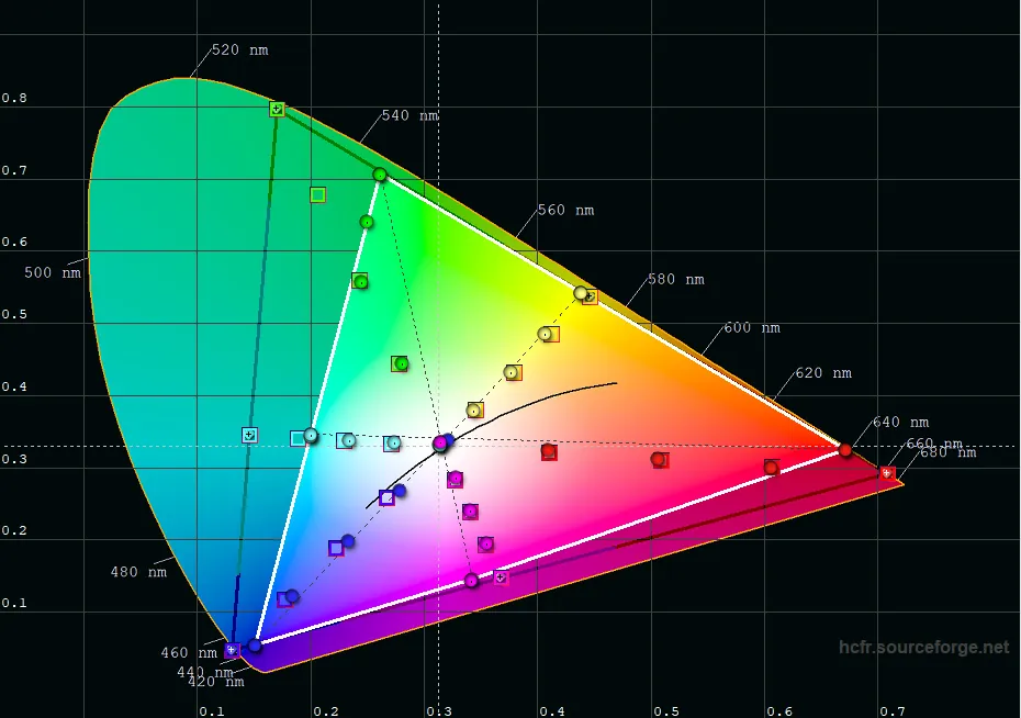
Finally, confirm colour accuracy by playing the ColorChecker patterns. Check that the results are roughly on target, as in the following illustration.

At this stage we have carried out the BT2020 calibration in SDR, that is with a linear gamma at either 2.2 or 2.4, as you prefer.
That calibration can be used for SDR BT2020 content. Which is typically the case if you use a DTM (Dynamic Tone Mapping) upstream of your display to play Ultra HD content in HDR. That is the case of DTMs such as MadVR (through an HTPC or an Envy scaler) or the Radiance Lumagen Pro scaler. The dynamic picture control of a DTM does indeed take care of turning HDR BT2020 streams into SDR BT2020. From then on the setting made at this stage will do perfectly.
Next we shall concentrate on the HDR setting. In particular the greyscale for the colour temperature setting, ending with the HDR EOTF luminance.
Setting the colour temperature in HDR
As for the REC709 setting, we shall have to run the greyscale patterns again to check that the colour balance is correct, still aiming for a temperature of 6500 K.
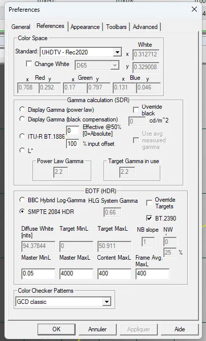
We are in an HDR context here, though. ColorHCFR's preferences therefore have to be changed accordingly. It is the EOTF HDR section that will now be used.
Tick the following parameters, as shown in the picture below:
- SMPTE 2084 HDR
- BT 2390
For now, do not tick the “Override targets” box. We shall use that parameter to fine-tune the luminance curve in the next chapter.
Now the patterns have to be displayed in HDR. There are several ways of doing that.
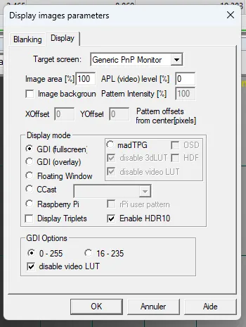
Method 1: your graphics card is HDR10-capable. It is therefore the card that will generate the patterns to the HDR standard. Do tick “Enable HDR10” in the pattern settings menu. If possible, switch the video card's output quantisation from 8-bit to 10-bit (RGB or YCbCr sampling, it does not matter).
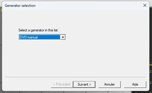
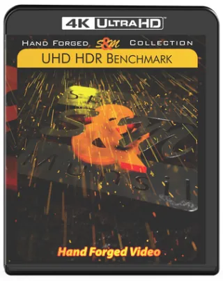
Method 2: your graphics card is not HDR10-capable but you have HDR greyscale patterns available on an external medium. Typically the excellent Spears & Munsil HDR demonstration disc (see here), which offers a large library of patterns, greyscale patterns encoded in HDR10 1000 nits among them. In that case ColorHCFR has to be told that you will use an external source to play the patterns. Select “DVD manual” in the generator choice when you open a new ColorHCFR measurement file.
Method 3: you have neither an HDR-capable graphics card nor greyscale patterns on an external source. That is not so serious. We shall play the greyscale patterns as we have done so far, staying in SDR on the PC, but forcing HDR mode manually on the projector. Comparing this method with method 2 gives strictly identical results. Illustration below on an Epson projector, switching “Automatic” mode to “HDR10” mode.
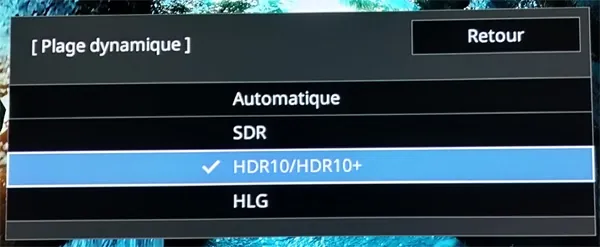
Whichever method you choose, make sure that while the greyscale patterns are playing the projector really is in HDR mode, with the BT2020 colour space used in the previous chapter.
Where the SDR standard can settle for a certain brightness (often around 50-60 nits depending on the context of use), in HDR the more brightness you have the better the result. You may therefore have to raise lamp or laser power accordingly. It is up to you to find the compromise between the comfort of brightness and the comfort of the projector's cooling-fan noise. Changing light output can affect the colour-temperature correction, so do set the light output of your display properly before starting the measurements.
From the measurements taken on several projectors, if the temperature has been properly calibrated in SDR, it will be in HDR too. And if corrections are needed (often caused by a different light-output setting) they should be fairly minor. The logic remains the same, namely using the gain and bias settings of the 3 RGB primaries to align the colours and avoid any cast, as the following illustration shows.
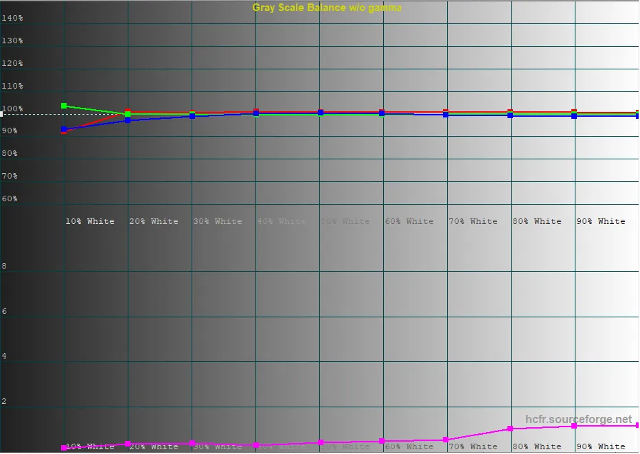
Finish by checking that the temperature curve is close to 6500 K.
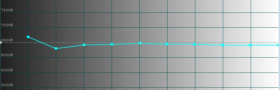
As with SDR calibration, at this stage of the settings your maximum brightness should no longer move. You can check it in the measures tab. We shall need it to fine-tune the luminance setting in the next chapter.
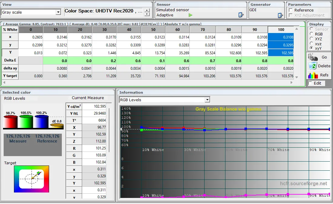
In the example below it is a Sony projector calibrated on its HDRRef memory. The DeltaE obtained is green over all the measured values. The brightness obtained is 102 nits, for 7622:1 of contrast.
Setting the EOTF luminance in HDR
We are nearing the end of the settings, but not the least of them. Here we shall no longer speak of a gamma curve, which no longer makes sense in HDR, but rather of a luminance curve (that is, EOTF, for Electro-Optical Transfer Function).
What makes it trickier is that there is no single predefined setting to reach (unlike gamma, where 2.2 or 2.4 is the aim) but potentially a multitude. The EOTF luminance curve we are about to measure gives the brightness to reproduce as a function of the greyscale, from black to white.
It should also be kept in mind that we are in a static HDR10 context here. The HDR10+ and Dolby Vision standards add a layer of metadata to let compatible displays interpret each frame better, drawing on the display's own capabilities.
Even so, a good HDR10 EOTF luminance setting upstream is always beneficial, and indispensable to the quality of an HDR video, whether HDR10, HDR10+ or Dolby Vision.
As for the colour-temperature measurement in the previous chapter, here too we shall use the greyscale patterns in an HDR context. The 3 methods still apply, namely:
- Method 1: HDR greyscale patterns generated if the PC's graphics chipset allows it
- Method 2: HDR greyscale patterns generated externally (UHD player or any other compatible source)
- Method 3: SDR greyscale patterns generated with the display forced manually into HDR
Here too, in so far as the projector pays no attention to the metadata (as with the latest Sony and Epson projectors, to name but two), the measurement result between methods 2 and 3 gives exactly the same values. To be rigorous it is always preferable to play genuine HDR10-encoded patterns, but it is clearly not indispensable.
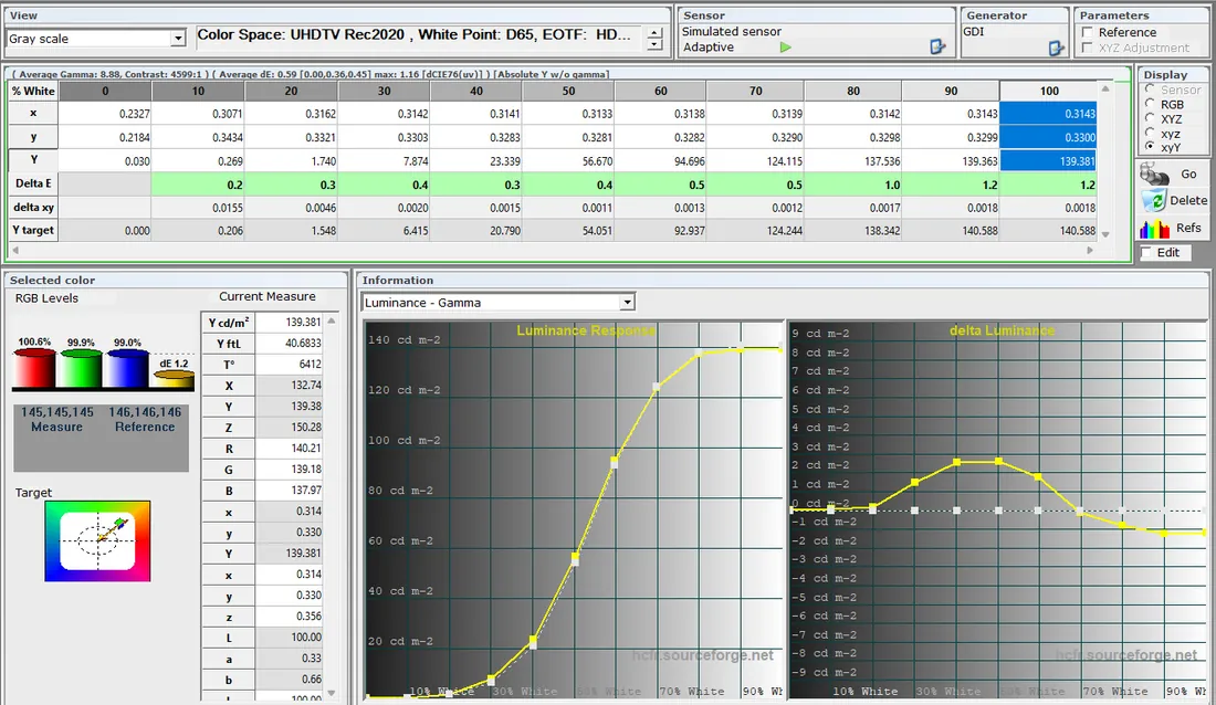
You can now go back to the measures screen (see the capture below). Then display the Luminance curve and the curve of the brightness error relative to the target to be reached (that is, Delta-Luminance).
As you can see, the ST2084 luminance curve has a particular shape: low at the start, then rising very quickly before reaching a plateau, also known as “clipping”.
The Delta Luminance curve on the right is handy for seeing how far off the target value you are. On both graphs everything is expressed in nits (that is, cd/m2).
Do not hesitate to scale manually or automatically by right-clicking each of the 2 graphs.
In this example, an Epson projector after calibration, the errors are very small, of the order of 2 nits for a maximum brightness of 139 nits (100 IRE pattern).
Before taking measurements, the shape of the target luminance curve has to be set properly.
As said above, there is potentially an infinite number of target HDR EOTF curves (that is, the dotted white curve). Concretely that curve depends largely on the following parameters:
- Master MinL: minimum brightness encoded in the HDR stream
- Master MaxL: maximum brightness encoded in the HDR stream
- Target MinL: the minimum brightness of your display (that is, the brightness of the 0 IRE pattern)
- Target MaxL: the maximum brightness of your display (that is, the brightness of the 100 IRE pattern)
- Diffuse White: an intermediate brightness, a notion we shall come to below
Go back into the EOTF (HDR) preferences window of ColorHCFR and you will see that all these parameters are available. They are all logically expressed in nits. By default you will notice that the 3 parameters Diffuse White, Target MinL and Target MaxL are pre-filled and greyed out by the application.
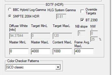
Leave the Master MinL parameter at 0, which implies maximum black for the incoming HDR video stream.
The Master MaxL parameter should generally be set to 4000 nits (the maximum value for HDR films, even though in theory an HDR stream can go up to 10000 nits). Films are usually encoded either at max 1000 nits or max 4000 nits.
Have some fun seeing the effect of those 2 values on the target curve. At 4000 nits clipping occurs around 85-90 % of the greyscale, whereas at 1000 nits clipping occurs around 75-80 %. By clipping we mean reaching maximum brightness in the highlights (that is, the plateau on the right-hand side of the curve).
An illustration of a target curve with Master MaxL set to 1000 nits, with clipping around 75 %.
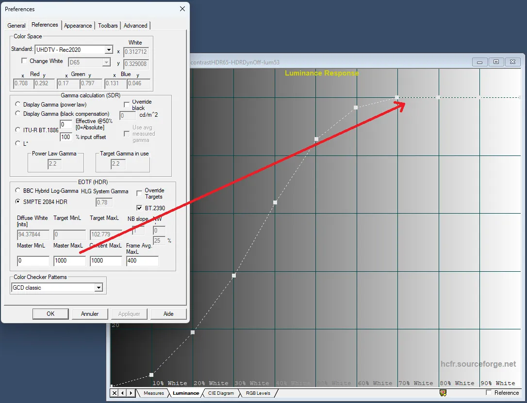
An illustration of a target curve with Master MaxL set to 4000 nits, with clipping at 85 %.
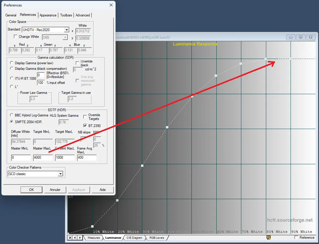
Run a first greyscale measurement and see whether your display clips nearer 75 % or nearer 85 %; that will be a clue as to the value to put in the Master MaxL field.
From the measurements taken so far, Epson projectors sit on MaxL 4000 nits and JVC projectors on MaxL 1000 nits. Sony, for its part, has chosen 2 separate settings:
- HDR Ref: for 1000-nit masters
- HDR10: for 4000-nit masters
So with Sony you will need 2 separate calibrations for the 2 uses. In that case do redo the colour-temperature calibration beforehand for each of those 2 memories.
Now that Master MinL and Master MaxL are settled you will probably see that the measured curve (in yellow) is a long way from the target (dotted white). Example below.
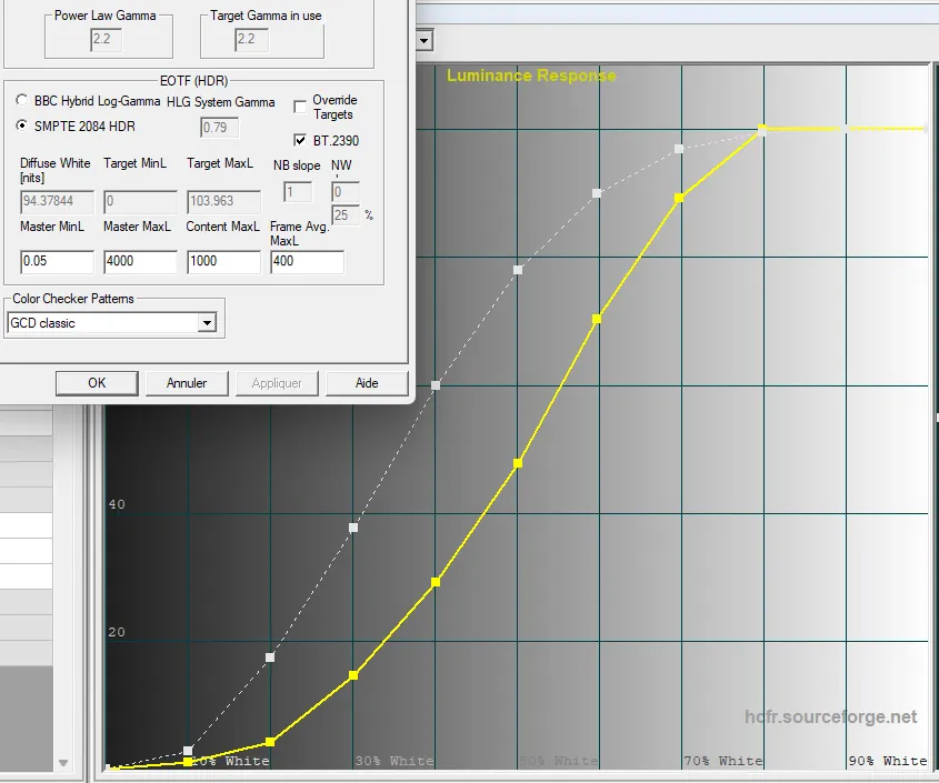
That difference comes from the 3 greyed-out parameters Diffuse White, Target MinL and Target MaxL. ColorHCFR fills in the “Diffuse White” value optimistically, and that value is not necessarily what the projector can produce.
Before going further, tick the “Override Targets” box to make those three parameters editable. Then fill in the 3 fields as follows:
- Target MinL: leave 0 by default (or else enter the black-floor value of the 0 IRE pattern, though the final differences will be minute)
- Target MaxL: enter the brightness value of the 100 IRE pattern
- Diffuse White: enter the brightness value of the 50 IRE pattern. The 50 IRE pattern represents the intermediate brightness and corresponds to the main inflection point of the HDR luminance curve.
Note the use of the display's measured maximum brightness. Hence the importance of having calibrated colour temperature beforehand, a setting that can affect brightness.
Below is an illustration, on the same example, of the target curve obtained by setting those parameters this way
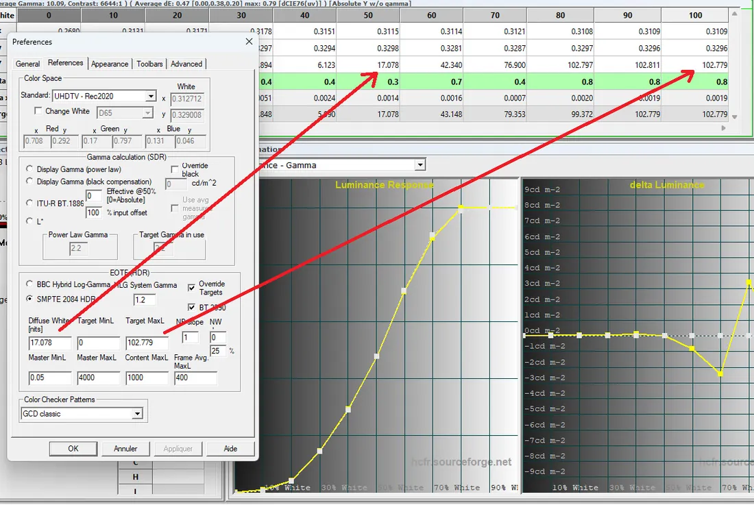
Once these three parameters have been applied manually you will see that the target curve is very close to the measured curve, as the illustration above shows.
That does not mean the result will be good, though. Here we have in a way cheated, by pinning the “Diffuse White” to the projector's own. It does give us a view of the display's HDR EOTF curve as the settings currently stand. The fact that the measured curve follows the target fairly well shows that the projector has a “consistent” luminance setting.
You can also display the luminance curve in brightness values, which is often more telling. Right-click the graph and select “Absolute Y”. The vertical axis now shows the value in cd/m2 (that is, nits) for each point of the greyscale.
In the following illustration the measured curve is also above the target from 70 % onwards, which will have to be corrected later.
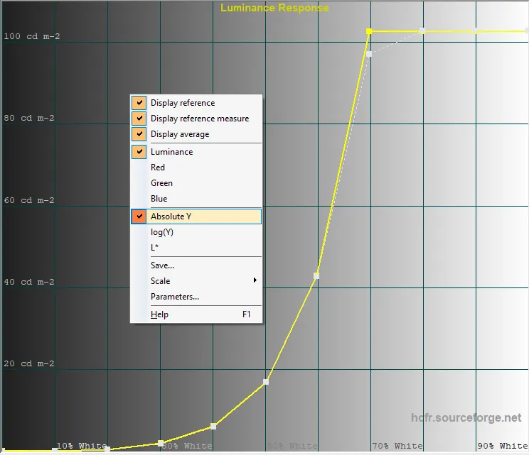
However, as we have just seen, the diffuse white parameter has a considerable effect on the shape of the target curve. In the example above it was measured at 17 nits (50 IRE pattern) for a MaxL of 102 nits (100 IRE pattern). Given the gap between those 2 values (a factor of 6) the result will be dynamic in the highlights, but mixed scenes will sorely lack brightness, especially in a projection context.
One finds that when the MaxL value is twice the Diffuse White, the result comes closer to SDR: namely a picture that is bright overall, but a less demonstrative rendering of the high luminous peaks HDR can provide. Conversely, the wider the gap between diffuse white and MaxL, the more pronounced the HDR effect, but potentially at the expense of the overall brightness of the picture. Where an HDR TV can afford a larger gap, thanks to its ability to modulate the light output of its pixels, for a projector it is far more complicated, if not impossible, to manage optimally.
There is unfortunately no rule. It is up to the user to choose. In projection, a ratio between MaxL and Diffuse White of between 2 and 3 at most gives the best results. Beyond that the picture becomes far too dark, especially compared with the same film in its SDR version.
Here is a middle ground worth aiming for:
- If your MaxL is around 50 nits, then try to aim for a Diffuse White of about 21-22 nits.
- If your MaxL is around 100 nits, then try to aim for a Diffuse White of about 43-45 nits.
- If your MaxL is around 140 nits, then try to aim for a Diffuse White of about 55-60 nits.
- and so on.
Some projectors allow the HDR Tone Mapping to be adjusted. That setting acts directly on the intermediate brightness value, and therefore on the Diffuse White. Obviously, the more you raise the diffuse white, the more the picture gains in brightness, with blacks opening up, but also potentially the more you blow the highlights. It is therefore a compromise to be chosen.
On the latest Epson laser projectors, for instance, the HDR dynamic range is adjustable from 1 to 20.
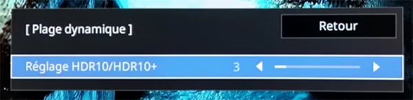
- The value 20 gives the darkest picture, with maximum detail in the very high lights.
- The value 1 gives the brightest picture, at the cost of a loss of detail in the highlights.
Illustration of the measurement on an Epson projector with the HDR dynamic range set to 8:
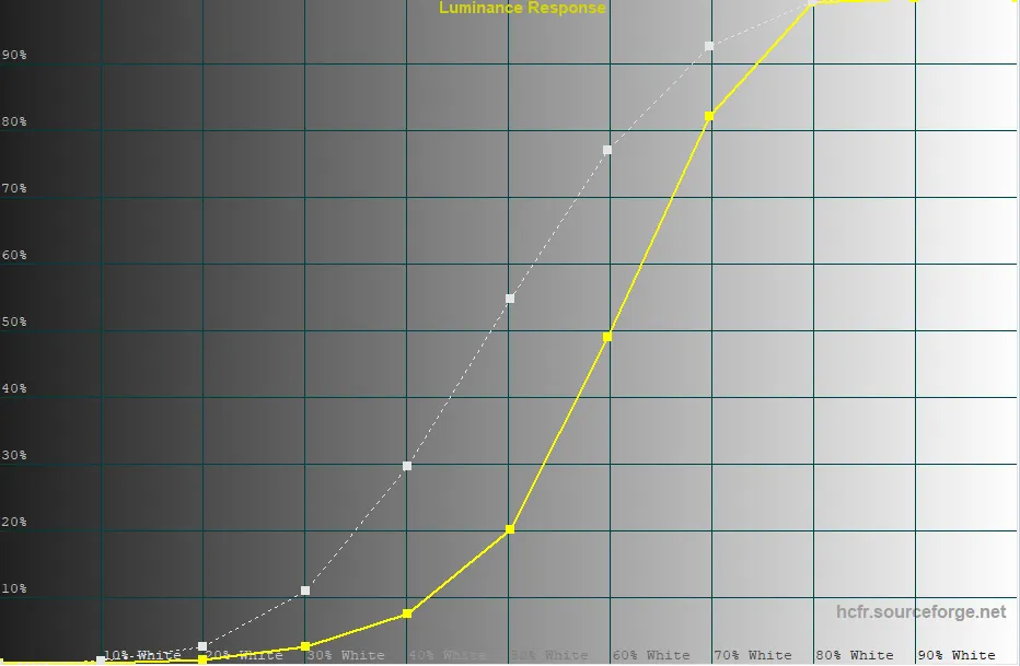
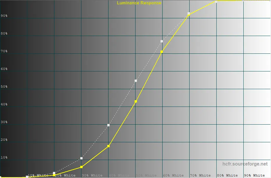
Illustration of the measurement on the same projector with the HDR dynamic range set to 1. The rise in intermediate brightness in the zone between 20 and 80 % of the greyscale is immediately apparent. The brightness value at 50 % has doubled without degrading the maximum black level (the black floor on the 0 IRE pattern), which matters.
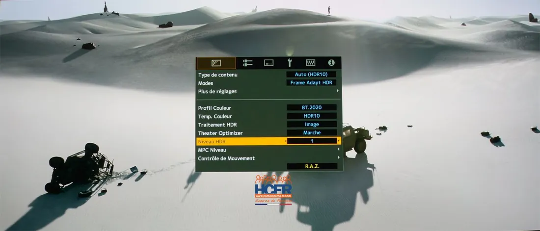
At JVC, on units fitted with a DTM (named FrameAdapt), there is also a Tone Mapping setting, called “HDR level”, running from -2 to +2. It too acts on the overall brightness of the picture and therefore affects the Diffuse White. That DTM also offers an automatic mode (“Normal” or “Wide”) which reads the basic metadata of the HDR stream (MaxCLL and MaxFall in particular) to choose dynamically the “HDR level” that suits best among those 5 values. The “Auto Wide” mode favours a brighter choice, in other words a higher Diffuse White.
Illustration below of the “HDR level” setting of a JVC projector, set manually to 1.
Other projectors offer no Tone Mapping setting but do allow the manual gamma setting to be used. In that case, do not hesitate to build a bell-shaped curve to boost the intermediate white, setting yourself a Diffuse White to reach.
For instance, if the greyscale measurement gives a MaxL (that is, the brightness on the 100 IRE pattern) of around 50-60 nits and an intermediate level at 50 IRE of around 10-15 nits, then you can try aiming for about 20-21 nits for the Diffuse White (the subjective proportion given above). Enter that target value in the HDR target curve parameters; see the illustration below on a concrete example: in red, the intermediate white level, below the expected value. The delta luminance curve forms a dip, which reflects the lack of brightness in the middle range.
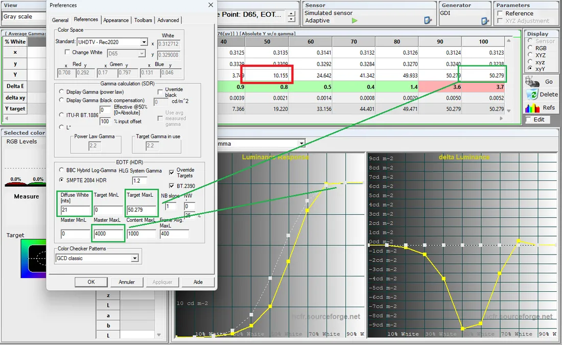
In this example one can see the need to raise the brightness levels, which will lead to a custom bell-shaped gamma setting (here an Epson model).
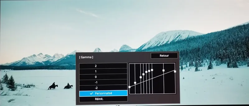
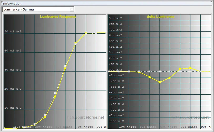
In the end we converge on a thoroughly satisfying result as measured, but above all to the eye, seeing that the picture has gained in legibility on dark scenes with a more comfortable overall brightness.
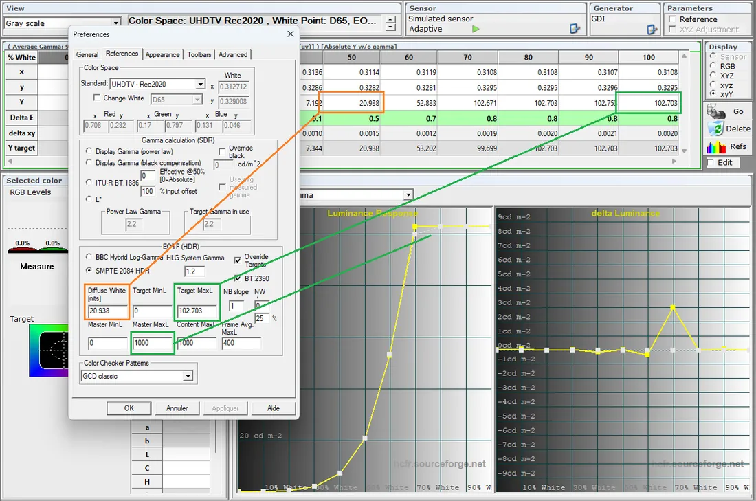
Unfortunately, some projectors offer neither a Tone Mapping setting nor a manual gamma setting. In that case you will have to live with the brightness measured at 50 % of the greyscale. See the illustration below with a Sony projector, where the Diffuse White (unfortunately too low in this example, of the order of 21 nits for a MaxL of 102 nits) cannot be changed by the projector for want of a setting. All that remains is to correct the curve at its far end, in particular the clipping zone, as we shall see below.
In every case, once the Diffuse White has been entered along with the MaxL in ColorHCFR's settings, the target curve is finally in place. All that remains is to set, if need be, the clipping and the rest of the curve with the tools each display provides.
Typically on Sony projectors clipping is set mainly through the setting named “Contrast HDR”. The more you raise that parameter, the more the measured curve rises on the right-hand side. Sony also offers a dynamic setting called “Dynamic HDR Enhancer”, with several levels: Off, Low, Medium or High. That setting also influences the clipping zone; switching it on lifts the curve on the right-hand side. Generally speaking it is better to work on the HDR contrast setting, which is finer, and to use the Dynamic mode as little as possible, since it can lose information in the highlights. But that choice remains up to the user.
The important thing is not to go beyond the target curve towards the clipping zone, at the risk of blowing the whites.
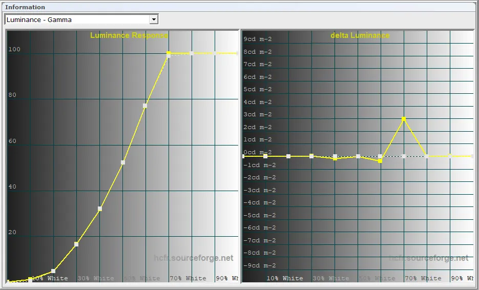
Below is an illustration of the luminance curve of a Sony projector. The Delta Luminance curve tells us there are 3 nits too many at 70 % grey. To optimise the result we can therefore lower the “Contrast HDR” so that clipping is not reached too early. The closer the Delta Luminance curve is to 0, the better the result.
However, if the HDR result on your Sony projector remains too dark for your taste, you can try resorting to the brand's Calibration Pro software (see the chapter on SDR gamma, where the use of that software is covered). The user can then build their own HDR luminance curve.
That solution is not without a downside, since the projector's HDR tone mapping will be lost, the “ContrastHDR” setting in particular. We shall then be in a purely SDR context, to which we shall apply a “home-made” ST2084 HDR luminance curve. Put into practice, though, it gives encouraging results.
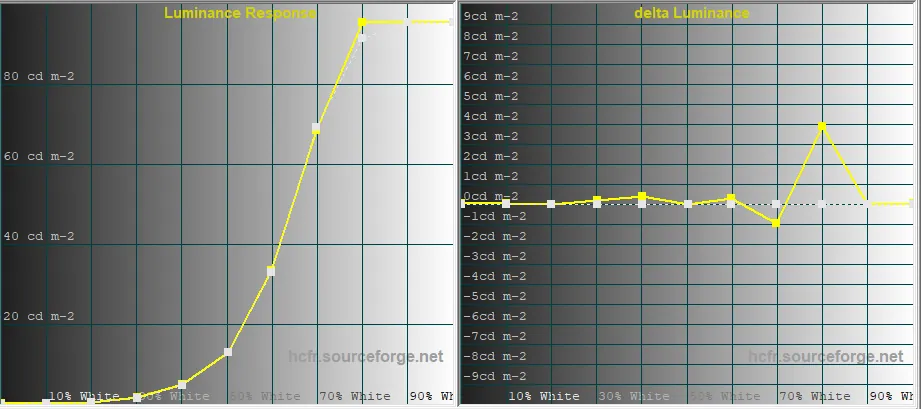
This time we set ourselves a “diffuse white” to reach. In the example below it is 26 nits, a purely arbitrary value, which is double the 13 nits obtained using the projector's default HDR curve. Going from one to two should be considerably visible on screen.
The projector's HDR10 curve, with a diffuse white value peaking at 13 nits for a maximum light output of 95 nits (MaxL)
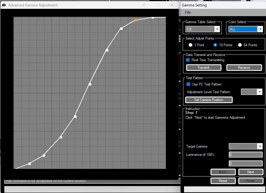
After several iterations using the ColorHCFR software, here is the new HDR luminance curve thus “customised” in the Sony software.
Below, the result as measured. The 26 nits are reached at 50 % of the greyscale (left-hand graph), with errors relative to the target curve below 1 nit (right-hand graph). In this example the laser power was deliberately set lower (75 %) to deepen the blacks.
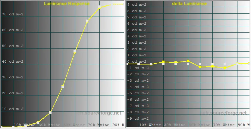
Generally speaking, one can see that this new EOTF curve raises the brightness level of the middle zones, between 40 % and 60 % of the greyscale. That zone is every bit as crucial as the low or high lights, since a great deal happens there, whether in films or in HDR video games.
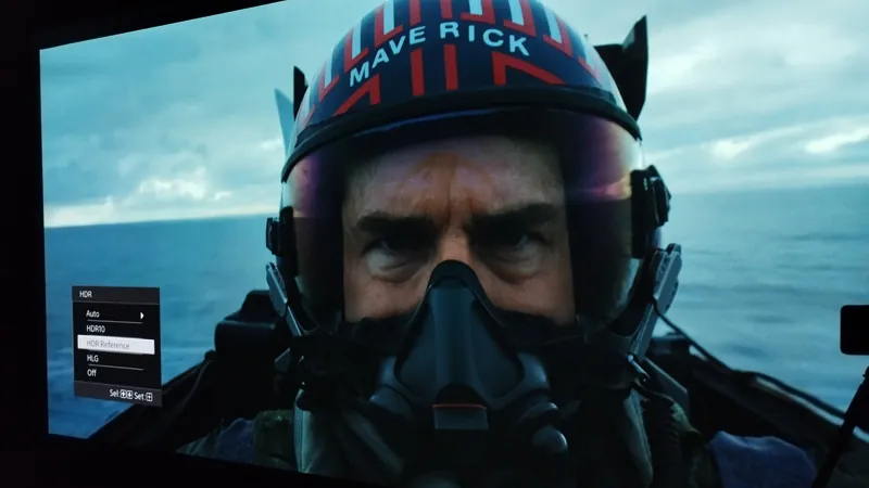
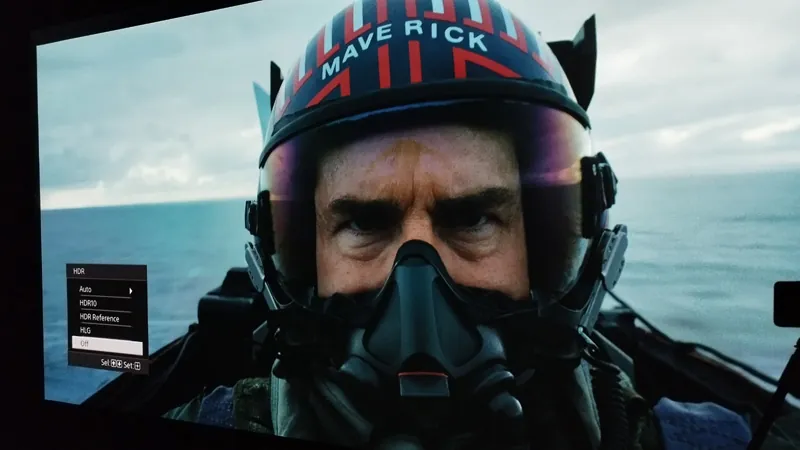
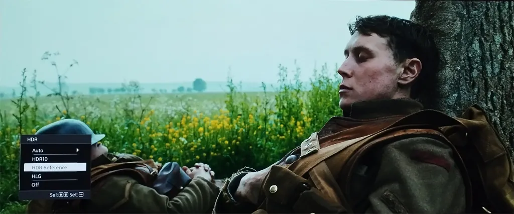
Here are a few photographs of the result obtained between these 2 curves.
Below, the result with the default HDR curve, laser at 100 % (Diffuse White: 13 nits; MaxL: 95 nits)
Below, the result with the custom HDR curve, laser at 70 % (Diffuse White: 26 nits; MaxL: 70 nits)
Another illustration
Below, the result with the default HDR curve, laser at 100 % (Diffuse White: 13 nits; MaxL: 95 nits)
Below, the result with the custom HDR curve, laser at 70 % (Diffuse White: 26 nits; MaxL: 70 nits)
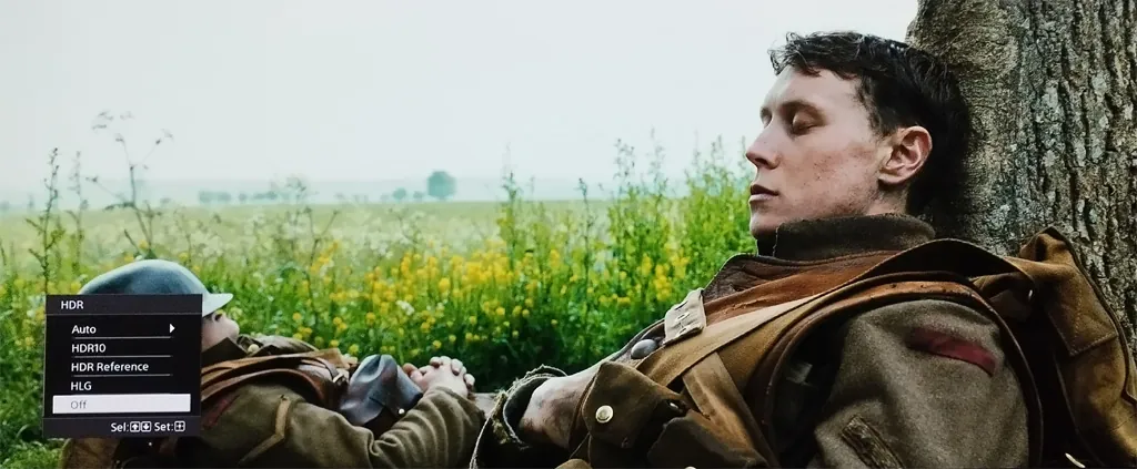
These few comparative photographs illustrate how important it is to be able to set the diffuse white on a projector. That parameter is the keystone of HDR calibration. Indeed, with the luminance curve customised using Sony's Calibration Pro software, the picture is brighter in the mixed zones even though the laser power has been lowered.
On projectors fitted with a custom gamma setting you will be able to change the parameters to make the measured curve hug the target as closely as possible. The methodology remains the same as for the SDR luminance setting: change the values step by step over the whole greyscale and take your measurements.
Converge little by little to make the measured luminance overlap the target luminance as closely as possible. The luminance error curve will then get closer to 0.
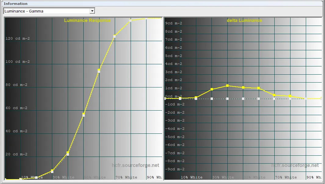
The HDR EOTF luminance of your display is now optimised. All that remains is to save the settings in a memory dedicated to REC2020 HDR, then to validate the result of this calibration by trying it on various videos of your choosing.
Conclusion
As we have seen over these chapters, a REC709 calibration with good results is fairly simple to carry out. It is a standard that displays on the market now handle relatively well.
REC2020 HDR calibration, on the other hand, still demands concessions today. Especially in a projection context, where much progress remains to be made. First on colour coverage (the BT2020 gamut), which only allows saturations to be corrected partly. And second on the ST2084 luminance setting, in finding the compromise between a dynamic picture, detailed in dark scenes, without blowing too much detail in the highlights, all with an intermediate brightness level that is comfortable to the eye.
Besides, using the HDR10+ and Dolby Vision formats will optimise the result obtained by the HDR10 calibration carried out here.
If your display is not natively Dolby Vision compatible, using LLDV (Low Latency Dolby Vision) to do the DV processing at the source is strongly advised. That will limit the clipping of scenes in the highlights, especially for films encoded at a high brightness level (typically 4000 nits).
It does happen, though, that HDR calibration leads to a visually less good result than SDR, typically a lack of detail in dark scenes, an intermediate brightness that is too low, and so on. In that case turning to a DTM (Dynamic Tone Mapping), internal or external, proves to be a solution. HDR rendering in projection is certainly going to evolve a great deal over the coming years.
These chapters should help you grasp the notions of video calibration, and get the best out of your displays.